⇦ Back to Resources
Lesson 3 - Videos
Simple Linear Regression and Confidence Intervals
Slide 1:
Tibshirani: Hello, everyone. We’re going to continue now our discussion of supervised learning. Linear regression is the topic, and actually, as we’ll see, it’s a very simple method. But that’s not a bad thing. Simple’s actually good. As we’ll see, it’s very useful, and also the concepts we learned in linear regression are useful for a lot of the different topics in the course. So this is chapter three of our book. Let’s look at the first slide. As we say, linear regression is a simpler approach to supervised learning that assumes the dependence of the outcome, \(Y\), on the predictors, \(X_1\) through \(X_p\), is linear. Now, let’s look at that assumption.
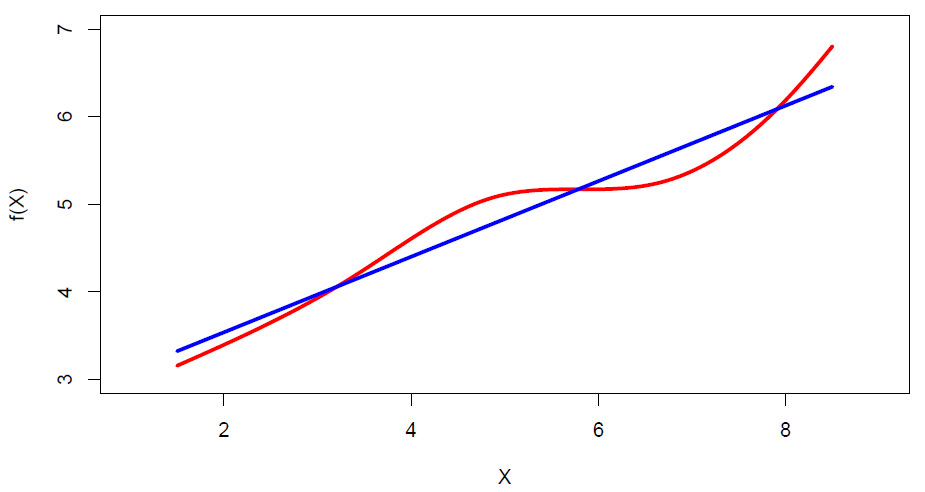
Figure 3.1
So in this little cartoon example, the true regression function is red. And it’s not linear, but it’s pretty close to linear. And the approximation in blue there, the blue line, it looks like a pretty good approximation. Especially if the noise around the true red curve, as we’ll see, is substantial, the regression curve in blue could be quite a good approximation. So although this model is very simple– I think there’s been sort of a tendency of people to think simple is bad. We want to use things that are complicated and fancy and impressive. Well, actually, I want to say the opposite. Simple is actually very good. And this model being very simple, it actually works extremely well in a lot of situations. And in addition, the concepts we learn in regression are important for a lot of the other supervised learning techniques in the course. So it’s important to start slowly, to learn the concepts of the simple method, both for the method itself and for the future methods in the course. So what is the regression model?
Slide 2:
Tibshirani: Well, before I define the model, let’s actually look at the advertising data, which I’ve got in the next slide.
Slide 3:
Tibshirani: This data looks at sales as a function of three kinds of advertising, TV, radio, and newspaper. And here I’ve got scatter plots of the sales versus each of the three predictors individually.
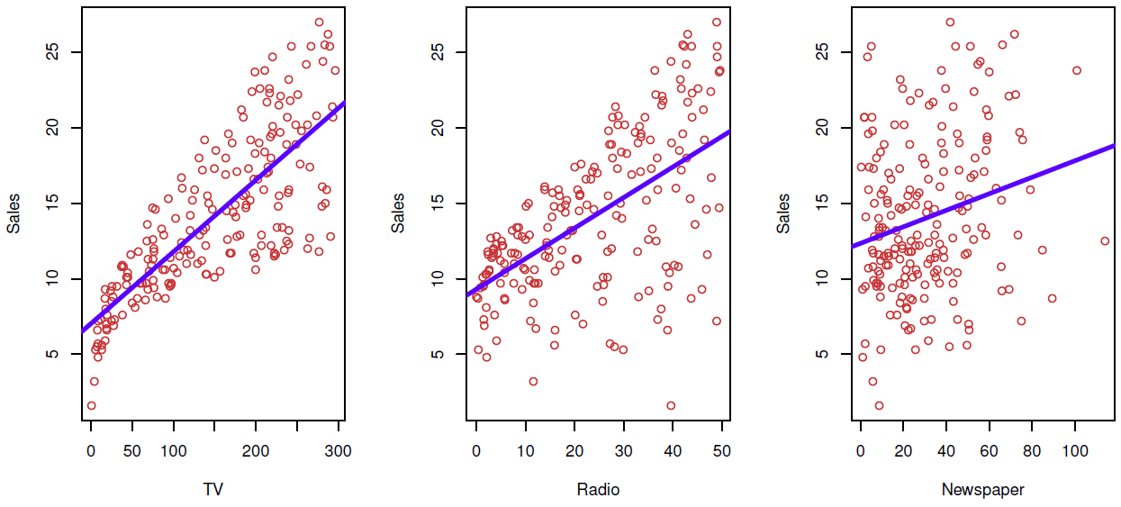
Figure 3.2– Linear fit of Sales vs. TV, Radio, Newspaper
And you can see the approximations by the regression line are pretty good. Looks like, for the most part, they’re reasonable approximations. On the left side, maybe for low TV advertising, the sales are actually lower than expected, which we can see here. But for the most part, the linear approximation is reasonable, partly because, again, the amount of noise around the curve, around the line, is quite large. So even the actual regression function was nonlinear, we wouldn’t be able to see it from this data. So this is an example of how it’s this crude approximation, which is potentially quite useful.
Back to Slide 2:
Tibshirani: So what are the questions we might ask of this kind of data, and would you might ask the regression model to help us to answer? Well, one question is, is the relationship between the budget of advertising and sales. That’s the sort of overall global question, do these predictors have anything to say about the outcome? Furthermore, how strong is that relationship? The relationship might be there, but it might be so weak as not to be useful. Now, assuming there is a relationship, which media contributed to sales? Is it TV, radio, or newspaper, or maybe all of them? If we want to use this model to predict, how well can we predict future sales? Is the relationship linear? We just discussed that already. If it’s not linear, maybe if we use a nonlinear model, we’ll be able to make better predictions. Is there synergy among the advertised media? In other words, do the media work on their own in a certain way, or do they work in combination? And we’ll talk about ways of looking at synergy later in this section.
Slide 4:
Tibshirani: OK, well, what is linear regression? Well, let’s start with the simplest case, where a simple model with just a single predictor. And this is the model here. It says that the outcome is just a linear function of the single predictor, \(X\), with noise, with errors, the \(\epsilon\).
\[Y = \beta_0 + \beta_1X + \epsilon\]So this is just the equation of a line. We’ve added some noise at the end to allow the points to deviate from the line. The parameters that are the constants, \(\beta_0\) and \(\beta_1\) are called parameters or coefficients. They’re unknown. And we’re going to find the best values to make the line fit as well as possible. So you see a lot terminology. Those parameters are called the intercept and slope, respectively, because they’re the intercept and slope of the line. And again, we’re going to find the best-fitting values to find the line that best fits the data. And we’ll talk about that in the next slide. But suppose we have for the moment some good values for the slope and intercept. Then we can predict the future values simply by plugging them into the equation. So if we have a value of \(x\), we want it for what you want to predict. The \(x\) might be, for example, the advertising you budget for TV. And we have our coefficients that we’ve estimated. We simply plugged them into the equation, and our prediction for future sales at that value of \(x\) is given by this equation.
\[\hat{y} = \hat{\beta}_0 + \hat{\beta}_1x\]And you’ll see throughout the course, as is standard in statistics, we put a hat, this little symbol, over top of a parameter to indicate the estimated value which we’ve estimated from data. So that’s a sort of funny way. That’s become a standard convention.
Slide 5:
Tibshirani: So how do we find the best values of the parameters? Well, let’s suppose we have the prediction for a given value of the parameters at each value in the data set.
\[\hat{y}_i = \hat{\beta}_0 + \hat{\beta}_1x_i\]Then the residual, what’s called the residual, is the discrepancy between the actual outcome and the predicted outcome.
\[e_i = y_i - \hat{y}_i\]So we define the residual sum of squares as the total square discrepancy between the actual outcome and the fit. The equivalent, if you write that out in detail, it looks like this, right?
\[RSS = e\begin{smallmatrix} 2\\ 1 \end{smallmatrix} + e\begin{smallmatrix} 2\\ 2 \end{smallmatrix} + \dots + e\begin{smallmatrix} 2\\ n \end{smallmatrix}\]This is the error, the residual for the first observation, square, second, et cetera. So it makes sense to say, well, I want to choose the values of these parameters, the intercept and slope, to make that as small as possible. In other words, I want the line to fit the points as closely as possible. Let’s see.
Slide 6:
Tibshirani: This next slide– I’ll come back to the equation in the previous slide, but this next slide shows in pictures.
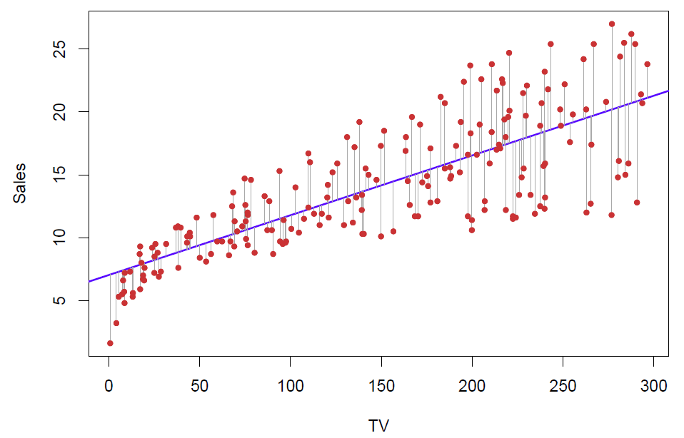
Figure 3.3– Residuals of the linear model
So here are the points. Each of these residuals is the distance of each point from the line. And I square up these distances. I don’t care if I’m below or above. I’m not going to give any preference. But I want the total score squared distance of all points to the line to be as small as possible. Because I want the line to be as close as possible to the points. This is called the least squares line. There’s a unique line that fits the best in this sense.
Back to Slide 5:
Tibshirani: And the equations for the slope-intercept are given here. Here’s the slope and the intercept.
\[\hat{\beta}_1 = \frac{\sum_{i=1}^{n}(x_i - \bar{x})(y_i - \bar{y})}{\sum_{i=1}^{n}(x_i - \bar{x})^2}\text{, }\hat{\beta}_0 = \bar{y} - \hat{\beta}_1\bar{x}\\ \textit{ where }\bar{y} \equiv \frac{1}{n}\sum_{i=1}^{n}y_i\textit{ and }\bar{x} \equiv \frac{1}{n}\sum_{i=1}^{n}x_i\textit{are the sample means.}\]So just basically a formula involving the observations for the slope-intercept, and these are the least squares estimates. These are the ones that minimize the sum of squares.
Slide 7:
Tibshirani: Of course, a computer program like R or pretty much any other statistical program will compute that for you. You don’t need to do it by hand. OK, so we have our data for a single predictor. We’ve obtained the least squares estimates. Well, one question we want to know is how precise are those estimates. In particular, we want to know what? We want to know, for example, is the slope 0? If the slope is 0, that means there’s no relationship between \(y\) and \(x\). Suppose we obtained a slope of 0.5. Is that bigger than 0 or not? Well, we need a measure of precision. How close is that actually to 0? Maybe if we got a new dataset from the same population, we get a slope of minus 0.1. Then the 0.5 is not as impressive as it sounds. So we need what’s called the standard error for the slope and intercept. Well, here are the formulas for the standard errors of the slope and intercept.
\[\textit{Standard error of slope, }\text{SE}(\hat{\beta}_1)^2 = \frac{\sigma^2}{\sum_{i=1}^{n}(x_i - \bar{x})^2}\\ \textit{Standard error of intercept, }\text{SE}(\hat{\beta}_0)^2 = \sigma^2[\frac{1}{n} + \frac{\bar{x}^2}{\sum_{i=1}^{n}(x_i - \bar{x})^2}]\\ \textit{where }\sigma^2 =\text{ Var}(\epsilon)\]Here’s the one we really care about. This is the square standard error of the slope. Its sigma squared, where sigma squared is the noise, the variance of the errors around the line. And this is interesting. It says this is the spread of the \(x\)’s around their mean. This actually makes sense. It says the standard error of the slope is bigger if my noise variance is bigger. That makes sense. The more noise around the line, the less precise the slope. This says the more spread out the \(x\)’s, the more precise the slope is. And that actually makes sense. I’ll go back to the sixth slide.
Back to Slide 6:
Tibshirani: The more spread out these points are, the more I have the slope pinned down. Think of like a teeter totter. Imagine I had the points, they were all actually concentrated around 150. Then this slope could vary a lot. I could turn it, change the slope, and still fit the points about the same. But the more the points are spread out in \(x\) across the horizontal axis, the better pinned down I have the slope, the less slop it has to turn. So this also says you have a choice of which observations to measure. And so maybe in an experiment where you can design, you should pick your predictor values, the \(x\)’s, as spread out as possible in order to get the slopes estimated as precisely as possible.
Slide 7:
Tibshirani: OK. So that’s the formula for the standard error of the slope and for the intercept. And what we do with these? Well, one thing we can do is form what’s called confidence intervals. So a confidence interval is defined as a range so that it has a property that with high confidence, 95%, say, which is the number that we’ll pick, that that range contains the true value with that confidence. In other words, to be specific, if you want a confidence interval of 95%, we take the estimate of our slope plus or minus twice the estimate of the standard error.
\[\hat{\beta}_1 \pm 2 \cdot \text{SE}(\hat{\beta}_1)\]And this, if errors are normally distributed, which we typically assume, approximately, this will contain the true value, the true slope, with probability 0.95.
Slide 8:
Tibshirani: OK, so what we get from that is a confidence interval, which is a lower point and an upper point, which contains the true value with probability 0.95 under repeated sampling. Now, what does that mean? This is a little tricky to interpret that. Let’s see in a little more detail what that actually means. Let’s think of a true value of beta, \(\beta_1\), which might be 0 in particular, which means the slope is 0. And now let’s draw a line at \(\beta_1\). Now imagine that we draw a dataset like the one we drew, and we get a confidence interval from this formula, and that confidence interval looks like this. So this one contains a true value because they’ve got the line is in between in the bracket. Now I get a second dataset from the same population, and I form this confidence interval from that dataset. It looks a little different, but it also contains a true value. Now I get a third data set, and I do the least squares computation. I form the confidence interval. Unluckily, it doesn’t contain the true value. It’s sitting over here. It’s above beta one. Beta one’s below the whole interval. And I get another dataset. Maybe I miss it on the other side this time. And I get another dataset, and I contain the true value. So we can imagine doing this experiment many, many times, each time getting a new dataset from the population, doing least squares computation, and forming the confidence interval. And what the theory tells us is that if I form, say, 100 confidence intervals, 100 of these brackets, 95% of the time, they will contain the true value. The other 5% of the time, they will not contain the true value. So I can be pretty sure that the interval contains the true value if I form the confidence interval in this way. I can be sure at probability 0.95. So for the advertising data, the confidence interval for beta one is 0.042 to 0.053. This is for TV sales. So this tells me that the true slope for TV advertising is– first of all, it’s greater than 0. In other words, having TV advertising does have a positive effect on sales, as one would expect. OK, so that completes our discussion of standard errors and confidence intervals. In the next segment, we’ll talk about hypothesis testing, which is a closely related idea to confidence intervals.
Hypothesis Testing
Slide 9:
Tibshirani: Welcome back. We just finished talking about confidence intervals in the previous segment, and now we’ll talk about hypothesis testing, which is a closely related idea. We want to ask a question about a specific value of a parameter, like is that coefficient 0? In statistics, that’s known as hypothesis testing. So hypothesis testing is a test of a relationship between– it’s a test of a certain value of a parameter. In particular, here the hypothesis test we’ll make is that, is that parameter 0? Is the slope 0? So what’s called the null hypothesis is that there’s no relationship between \(X\) and \(Y\). In other words, \(\beta_1 = 0\). That’s the equivalent statement. The alternative hypothesis is that there is some relationship between \(X\) and \(Y\). In other words, \(\beta_1 \neq 0\). And \(\beta_1\) could be positive or negative. So mathematically, this corresponds to \(\beta_1\) being 0. Is the null hypothesis \(\beta_1\) not equal 0? So that’s often the question you want to ask. That’s usually the first question you want to ask about the predictors.
Slide 10:
Tibshirani: So to test the null hypothesis, we form what’s called a t-statistic. We take the estimated slope divided by the standard error. This will approximately have a t-distribution with \(n - 2\) degrees of freedom assuming that the null hypothesis is true. Now, what is a t-distribution? You don’t have to worry too much about that. It’s basically you look this up in a table or, nowadays software will compute it for you. It’s basically a normal random variable except for small numbers of samples. \(n\) is a little bit different. In any case, you ask the computer to compute the p-value based on this statistic. p-value is the probability of getting the value of \(t\) at least as large as you got in absolute value.
Slide 11:
Tibshirani: So for the advertising data using, again, just TV, here are the results.
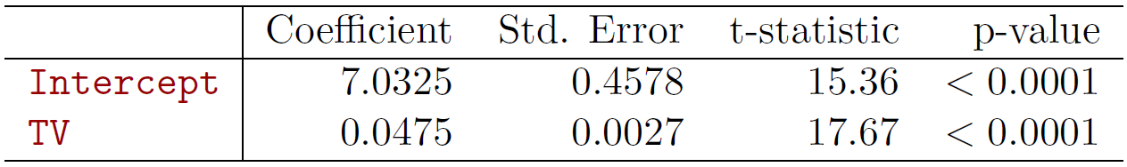
Figure 3.4
Here are the slope and intercept of that line. So saw the least squares line. Standard errors. Here are the t-statistics. That’s just the coefficient divided by the standard error. The one we care most about is for TV. The intercept isn’t really very interesting. That’s telling us what happens– what are the sales when the TV is 0? TV’s budget is 0. But the one we care most about here is this guy. So this is measuring the effect of TV advertising on sales. And the t-statistic is huge. It turns out in order to have a p-value of below 0.05, which is quite significant, you need a t-statistic of about 2. We’re at 17, so it’s very, very significant. So the p-value is very, very small. So how do we interpret this? It says the chance of seeing this data, under the assumption that the null hypothesis– so there’s no effect of TV advertising on sales– is less than 10 to the minus 4. So it’s very unlikely to have seen this data. It’s possible, but very unlikely under the assumption that TV advertising has no effect. Our conclusion, therefore, is that TV advertising has an effect on sales– as we would hope.
Slide 12:
Tibshirani: OK? So we’ve seen how to fit a model with a single predictor and how to assess the slope of that predictor, both in terms of confidence intervals and hypothesis test.
Back to Slide 8:
Tibshirani: Well, I did want to add one thing that’s important. So we’ve seen the hypothesis test. And before that we saw confidence intervals. There’s actually a one-to-one correspondence. In other words, they’re doing equivalent things. To be more precise, if hypothesis test fails– in other words, if we reject the null hypothesis and conclude that \(\beta_1 \neq 0\), as we did for TV advertising, correspondingly the confidence interval constructed for that data for the parameter will not contain 0. Conversely, if the hypothesis test does not reject, so we cannot conclude that TV advertising has an effect. Its slope may be 0. The confidence interval for that parameter will contain 0. So really, the confidence interval is also doing hypothesis testing for you. But it’s also telling you how big the effect is. So it’s always good to compute confidence intervals as well as do hypothesis test. So for example, here we see the interval doesn’t contain 0. Furthermore, we see that a lower limit on the effect of TV advertising is 0.042, which we can interpret as– these are in $1,000 units, that we’re going to affect sales by 1,000 times– so for every 1,000 change in TV advertising, we’ll get a corresponding change in sales. So this tells us not only is the effect 0 or not, but how big is the effect likely to be?
Slide 12:
Tibshirani: OK. So where are we now? Let’s see. So we’ve talked about how to assess the slope of an individual predictor. How about the overall fit of the model, the accuracy of the model? Well, what we can do here is we’ll take the residual sum of squares.
\[RSS = \sum_{i=1}^{n}(y_i - \hat{y}_i)^2\]Remember, this is the quantity that we minimize in the first place to get the best estimates of the intercept and slope, the least squares estimates. So we’ll take what’s called the mean squared residual and take the square root.
\[RSE = \sqrt{\frac{1}{n - 2}RSS}\]This is the average squared deviation that we achieve using the least fitting line, where this is the residual sum of squares. And we complete what’s called the R squared or the fraction of variance explained. And here it is. It’s the total sum of squares minus the residual sum of squares over the total sum of squares.
\[R^2 = \frac{\text{TSS} - \text{RSS}}{\text{TSS}} = 1 - \frac{\text{RSS}}{\text{TSS}}\\ \textit{where }TSS = \sum_{i=1}^{n}(y_i - \bar{y})^2\]So what is this conceptually? Well, if we didn’t fit a model at all, if we forget about TV advertising and just use the mean of sales as the prediction, that’s the simplest prediction you can imagine. This would be our error. Here’s our prediction. Here’s the true sales. So this is the no model error. And now, the residual sum of squares of the fitted model is RSS. This is how much– it’s going to be lower than this guy. It’s going to be lower because we could always achieve this guy just by choosing a slope of 0. So since we’ve done least squares, we’ve optimized over the parameters. We know that RSS will be less than TSS. But this quality measures, how much did we reduce the total sum of squares relative to itself? And here, written in this way or this way. So this is the fraction of variance explained. And it can be shown algebraically.
\[r = \frac{\sum_{i=1}^{n}(x_i - \bar{x})(y_i - \bar{y})}{\sqrt{\sum_{i=1}^{n}(x_i = \bar{x})^2}\sqrt{\sum_{i=1}^{n}(y_i - \bar{y})^2}}\]This is actually equivalent to the squared correlation between \(X\) and \(Y\). So this is simple correlation between the predictor of the outcome. It kind of makes sense, right? The higher the correlation, the more that we’ll explain the variance. And there’s actually an exact algebraic relationship that the squared correlation is equal to this fraction of variance explained.
Slide 13:
Tibshirani: So what did we get for our data? The R squared is 0.61. So in other words, using TV sales, we’ve– the budget. Excuse me, TV budget. We reduced the variance in sales by 61%. That’s a very strong predictor. The F-statistic we’ll talk about in a few minutes. It’s also a measure of how well the overall model is doing. So this is quite impressive. In business and some kind of physical sciences, we see R squareds like this. In medicine, we don’t tend to see R squareds. You might see an R squared of 5% and you might get excited. So always one has to remember the domain to sort of– to have a judge of how good an R squared is. But this is an impressive R squared, which you see sometimes in business and finance applications. So that completes our discussion of regression with a single predictor. In the next section, we’ll move on to the harder problem where we have multiple predictors and we do a multiple regression.
Multiple Linear Regression and Interpreting Regression Coefficients
Slide 12:
Tibshirani: We’re now going to start our discussion of multiple linear regression, which is regression with more than one predictor. I should say the term regression is kind of unusual. You might be wondering, why linear regression? It’s a linear model. And this actually is an unusual term. It’s actually historical. It comes from the idea of regression towards the mean, which is a concept which was discussed in the early 1900s. You might want to look that up yourself and later on in the course we’ll describe what regression towards the mean is. But it’s resulted in a sort of unusual name for a linear model called linear regression. But we have to live with this term because it’s become time honored. So multiple linear regression now extends the simple model for when we have more than one predictor. Like in our example, we have three predictors. So we want to fit them all together and use them all together to predict the outcome. So here’s the model.
\[Y = \beta_0 + \beta_1X_1 + \beta_2X_2 +\dotsb+ \beta_pX_p + \epsilon\]We have an overall intercept term, and then we have a slope for each of the predictors in the model. Which again, the betas or the parameters, they’re unknown. And the \(X\)’s are observed. And we’re trying to use the \(X\)’s to predict \(Y\). So in the advertising example we particularly will have the three predictors TV, radio, and newspaper advertising. And we’re going to try to predict sales. And we have the error term along points to deviate around the function.
\[\text{sales} = \beta_0 + \beta_1 \times\text{ TV }+\beta_2 \times\text{ radio }+\beta_3 \times\text{ newspaper }+ \epsilon\]And now the function actually is a– it’s called a hyperplane. Let’s actually flip a head to slide 19 for a moment where I have a picture of this. So whereas before we had a line, now it’s a hyperplane. So I’ve been able to draw it here just for two predictors. It’s hard to draw it for three. But now the line is now replaced by this flat surface called a plane or hyperplane. So here’s our data points. For each point we have its two predictor values, let’s say TV and newspaper. And we have its sales on the vertical axis. And here’s each data point is a red point. What multiple aggression does, it fits a hyperplane, a plane to these points to minimize the square distance between each point and the closest point on the plane. Very intuitive. The same way we did it for a line, now the line becomes a plane. So let’s now go back to the model, again. So it’s an equation of hyperplane with its coefficients.
Slide 15:
Tibshirani: Well, before we talk about the least squares estimates and some of the details, let’s step back for a moment and think about how you might interpret the regression coefficients. Because now there’s more than one of them. In a simple model we had only one to deal with. Now we have a multiple, say three coefficients. How do we interpret them together? Well, if the predictors had no correlation in the data, then we could talk about each coefficient separately. We can make statements like, a unit change in \(X_j\), for example, is associated with a \(\beta_j\) change– that’s its coefficient– in the outcome. With all the other variables fixed. But predictors are not usually uncorrelated in the data. For example, here we can expect– and we’ll see it actually– that the various amounts spent on the three kinds of advertising are correlated. So these kinds of interpretations are difficult in observational data where they’re correlated. What problem does the correlation cause? Well, the variance of all coefficients tend to increase, sometimes dramatically. In particular, imagine we have two predictors which are almost identical. Then we can’t really separate their coefficients, right? If I have a coefficient on one variable I could just as soon move that coefficient to the other variable. And the fit of the model is going to be pretty much the same. So the variance of the coefficients of those two predictors are going to be very large. And then interpretation becomes difficult when there’s a correlation. Because one can’t really say, suppose I were to change \(X_j\). And we can think about, suppose I was to increase the TV advertising by a certain amount. What would be the effect on sales? Well if that happened, we probably wouldn’t be reasonable to assume that the other advertising budgets stay the same. For example, maybe the company has a fixed budget overall. So that if I increase TV advertising, I’d have to decrease the other advertising. Or maybe TV advertising is increasing just because that company has more money in general and decides it wants to spend more on advertising of all kinds. So in both those cases we can’t really talk about the change of one predictor where the other one’s fixed because the predictors will tend to move together in real data. And what this means is claims of causality should be avoided. We can’t really say that one predictor causes the outcome when there’s predictors in the system that are correlated with that given predictor. So this becomes a complicated challenge to try to discuss causality. And we’re going to avoid that.
Slide 16:
Tibshirani: And there’s a nice book which, when I was a graduate student, was one of the books I learned from, Data Analysis and Regression by Mosteller and Tukey, two very famous statisticians. And I look at the book now and I don’t like the book that much overall. But there’s one wonderful chapter called the woes of regression coefficients that talks about the problems of interpreting regression coefficients in a multiple regression model. That’s a very useful chapter to read. And I’ve made this point. So the first point here I’ve just made, a regression coefficient measures the change in \(Y\) per unit change in \(X_j\) with all other predictors held fixed. But this is not usually a reflection of reality. Because usually when you change one predictor the others change as well. I mentioned the example with advertising. So here’s couple of examples which I’ll just have you think about. And maybe we’ll put it on a quiz. But here’s an example, the first example, to have you think about this point. Suppose I measure the total amount of change in your pocket. That’s \(Y\). I also measure two predictors, the number of coins, \(X_1\), and the number of pennies, nickels, and dimes. That’s \(X_2\). Now by itself, the regression coefficient of \(Y\) on the total number of pennies, nickels, and dimes will probably be positive, right? The more you have of these, the more likely you have more change. But what about if I have \(X_1\) in the model? So for a given level of \(X_1\), think about whether the coefficient of \(X_2\) will be positive or negative. And talk about the answer to this later on. But that’s a simple example where you can see now how the presence of one predictor affects the way that we think about and interpret the coefficient of another predictor. And of course, these two predictors are highly correlated by construction. Another example, which is actually from a chapter in this book, from American football. \(Y\) is the number of tackles by a football player in a season. \(w\) and \(h\) are his weight and height. And then imagine that they take data from this situation, they fit a regression model, and they obtain \(\beta_0\).
\[\hat{Y} = \beta_0 + .5w - .1h\]The coefficient of weight is 0.50. Coefficient of height is minus 0.10, which seems to say that it’s better to be short to make more tackles. So the question we’re asking here is, how would you interpret this coefficient of height given the weights in the model? And again, think about this and we’ll return to the answer later.
Slide 17:
Tibshirani: And they also mention in that same book, there’s two quotes essentially by George Box who was another famous statistician. Essentially all models are wrong but some are useful. This is interesting. Because it’s true that, as we saw like on the very first slide, the regression model, a linear model, is never exactly right. But it’s often very useful. So it’s important to remember that the model that you assume is not to take it too seriously. Test out your model. Remember that it’s going to be wrong. But also remember the fact that, despite the fact it’s an approximation, it can be a very useful approximation in many situations. And then this point in their chapter, also paraphrasing George Box, which really sort of sums up what I talked about trying to interpreting coefficients, the only way to find what will happen when a complex system is disturbed, is to disturb the system, not merely to observe it passively. In other words, if you want to make a causal statement about a predictor for an outcome, you actually have to be able to take the system and perturb that particular predictor keeping the other ones fixed. That will allow you to make a causal statement about a variable like \(X_j\) and its effect on the outcome. It’s not good enough simply to observe some observations from the system. We can’t use that data to conclude causality. So if you want to know what happens when a complex system is perturbed, you have to perturb it. You can’t simply observe it. So I think that’s a very wise summary of the use of models and observational data.
Slide 18:
Tibshirani: So how do we find the least squares estimates for the multiple regression model? Well, t’s really very much the same, the same tack we took for the simple model. So first of all, our predictions will be given by this equation.
\[\hat{y} = \hat{\beta}_0 + \hat{\beta}_1x_1 + \hat{\beta}_2x_2 +\dotsc+ \hat{\beta}_px_p\]\(\hat{\beta}_0\) is the intercept. And now we have one slope parameter for each predictor. We put hats on there, as we always will when we infer that value from data, the estimates. And now what’s called the multiple least squares estimates are the values that minimize the sum of square deviations of points around the plane.
Slide 19:
Tibshirani: Let’s go– remember, I showed this picture.
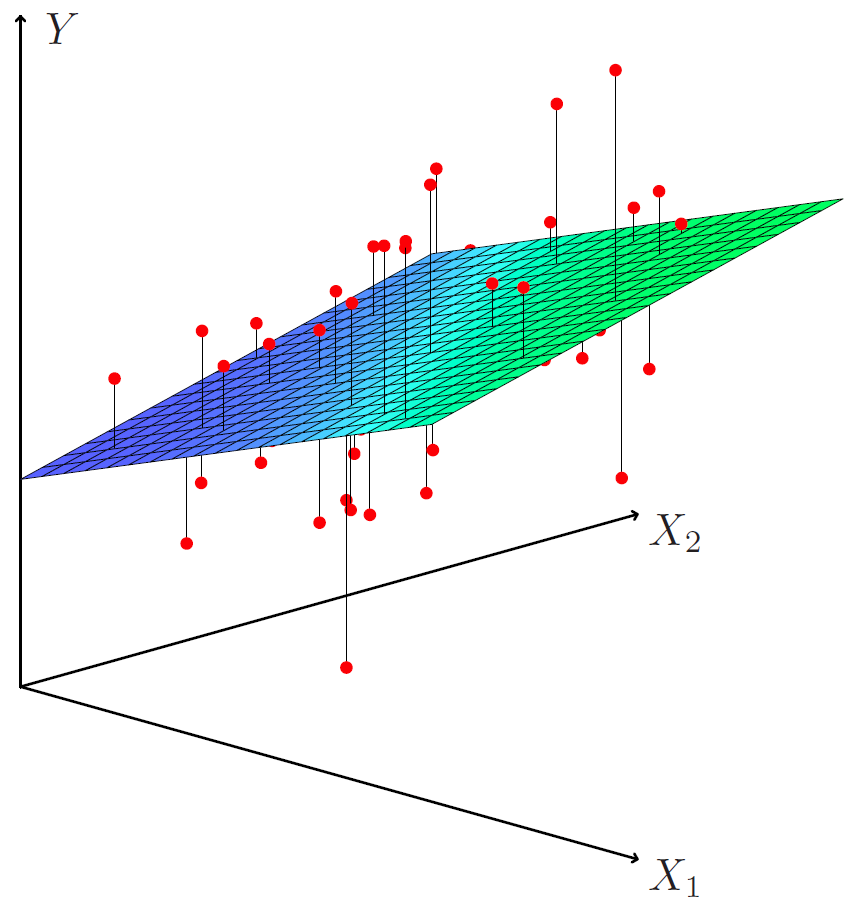
Figure 3.5
Here’s my data points, here’s my approximating least squares plane. And I’m going to choose the orientation and height of this plane to minimize the total squared distance between the red points and the closest point on the hyperplane.
Back to Slide 18:
Tibshirani: Those are called the least squares estimates. They’re called the multiple least squares estimates because there’s multiple predictors. There’s is a formula for these coefficients, for the estimates.
\[\text{RSS} = \displaystyle\sum_{i=1}^{n}(y_i - \hat{y_i})^2\]It’s kind of messy. And it’s not something that anyone ever computes by hand. Although probably in the early 1960s people use to do these. Poor guys used to actually compute least squares estimates by hand. They were good at doing matrix computations. But today we have the luxury of fast computers. And in a program like R or any other statistical package, we can compute the least squares estimates for very big data sets very quickly. So we don’t need to worry about the formula. We just need to know what we’re doing, which is we’re finding the values of the coefficients that minimize the sum of squares.
Slide 20:
Tibshirani: So here’s what we get for the advertising data.

Figure 3.6
The top table are the coefficients, standard errors et cetera. So these are the least squares estimates. Again, there’s a lot of terminology here. Coefficient or parameter, we’ll use those interchangeably as people do. The intercept. Again, we’re not typically interested in the intercept. Because that’s just telling us whether setting the other three predictors to 0, whether the sales is the average sales value. So we don’t really care about that. But we care about the slopes, which are these guys. These three values here. So we see, for example, the coefficient of TV is 0.46. Standard error, the t statistic is the ratio, 0.46 divided by 0.0014. And the t statistic, remember I said a t statistic of bigger than about 2 is significant at p value of 0.05. So the t statistic of 32 is huge. And p value is less than 0.0001. Similarly for radio. Very big effect. Newspaper. Newspaper looks like it’s not having much effect. Its t statistic is minus 0.18, which has got a p value which is large. And p values close to one– p values above 0.05 or 0.1 are not significant. They’re not evidence against the null hypothesis, which is that the coefficient is 0. But let’s be a little more careful how we interpret this. Remember, each of these statements is made conditional on the other two being in the model. So in particular, this coefficient says, given I have the amount of money spent on radio and newspaper, spending money on TV still produces a change in sales. So in the presence of the other two predictors, TV is important. Similarly for radio. The presence of TV and radio advertising– excuse me, TV and newspaper advertising, radio advertising can be effective. But newspaper is not, in the presence of these two. So in particular, on its own newspaper may be significant, its coefficient may be significant. But in the presence of the other two, in the multiple model, it’s not showing significance. And we can look at the correlations actually here. Here are the simple correlations between the predictors. And we see there’s some significant correlations. For example, TV and sales– well, sales is the outcome. But in particular, radio and newspaper have a correlation of 0.35. So what’s likely happened here is that any effect of newspaper has been soaked up by radio because they’re correlated at 0.35. So with radio in the model, newspaper’s no longer needed. It doesn’t tell us anything more. It doesn’t improve the prediction given we’ve measured the radio advertising. And that’s because of the correlation being 0.35. And the other hand, it looks like TV and radio were pretty uncoordinated. And their effects are somewhat complimentary. So that completes our discussion of this example, in the next segment we’ll talk about some important questions that arise when you use regression for real data analysis.
Model Selection and Qualitative Predictors
Slide 21:
Tibshirani: Welcome back. We’re now going to talk about some important questions that arise when you use aggression in real problems. So is at least one of the predictors useful in predicting the response? That’s the first order question. Do the predictors on the whole have anything to say about the outcome? If not, we probably want to stop there. But given that there is some effect overall, which of the predictors are important? Are they all important, or only some subset? How well does the model fit the data? And also, given a set of predictor values, what response value should we predict? So what’s our prediction of sales given a certain level of advertising in the three modes? And how accurate is that prediction? So these are all things we can answer from the model. Well, at least 1, 2, and 4. 3 we’ll examine by looking at some alternative models.
Slide 22:
Tibshirani: So the answer to the first question– is at least one predictor useful?– does a model overall have any predictive value. We look at the drop in training error. So this is the total sum of squares.
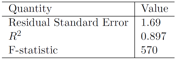
Figure 3.7
Remember, if we just used the mean to predict, that’s the no predictor model. This is the residual sum of squares achieved using all three predictors. And we can look at the drop, the present variance explained– which I actually have that here for that. We defined this earlier. Now it’s 0.897. So it was about 0.6 something before. Now by adding the two more predictors, we’ve increase that to 0.897. So this says that we reduced the variance of sales around its mean by almost 90% by using these three predictors. That seems pretty impressive. To quantify that in a more statistical way, we can form the f ratio, which is defined as follows.
\[F = \frac{(TSS - RSS)/p}{RSS/(n - p - 1)} \sim F_{p,n-p-1}\]It’s the drop in training error divided by p– p is number of parameters we fit. Here, it’s three, right? The three kinds of advertising budgets, divided by the mean squared residual. So \(n\) is the sample size, and we subtract off the number of parameters we fit, which is \(p + 1\) for the intercept. So statistical theory tells us that we can compute the statistic and under the null hypothesis, that there’s no effective of any of predictors, this will have an f distribution with \(p\) and \(n - p - 1\) degrees of freedom. And again, there are tables of this. Or your computer program will compute this for you. This f statistic here is huge. And its p value I haven’t recorded here, but it’s less than 0.0001. So this says what we believe already, looking at this previous tables and the graphs, that there’s a strong effect here of the predictors on the outcome. They have something to say about the outcome.
Slide 23:
Hastie: OK, when we fit linear regression models, one of the things we have to do is decide on what are the important variables to include in the model. By the way, this is not Rob anymore. Rob asked me to do this section because it’s a little hard for him. Kidding. So the most direct approach is called all subsets or best subsets regression. So basically, what you’re going to do is you’re going to compute the least squares fit for all the possible subsets of the variables and then choose between them based on some criterion that balances the train error with the model size. Now, this might seem like a reasonable thing to do if you have a small number of variables. But it gets really hard when the number of variables gets large. So if you’ve got \(p\) variables, there are \(2^p\) subsets. And you know, that \(2^p\) grow exponentially with the number of variables. So for example, when \(p = 40\), there are over a billion models. So we’re talking about subsets like the model might have variable 1, 3, and 5 in it. That’s a subset of size 3. And then another model might have a subset of size four. And with 40 variables, there’s over a billion such models. So that clearly becomes cumbersome, searching through such a big model space. And so what we need instead is an automated approach that searches through for us, and that finds a subset of them. And so we’ll describe two commonly used approaches next.
Slide 24:
Hastie: Forward selection is a very attractive approach, because it’s both tractable and it gives a good sequence of models. So this is how it works. You start with a null model. And the null model has no predictors in it, but it’ll just have the intercept in it. And the intercept is the mean of \(Y\) with no other variables in the model. And now what you do is you add variables one at a time. So the first variable you add, you do it as follows. You fit \(p\) simple linear regression models, each with one of the variables in and the intercept. And you look at each of them. And you add to the null model the variable that results in the lowest residual sum of squares. So basically, you just search through all the single-variable models and pick the best one. Now having picked that, you fix that variable in the model. And now you search through the remaining \(p - 1\) variables again and find out which variable should be added to the variable you’ve already picked to best improve the residual sum of squares. And you continue in this fashion, adding one variable at a time, until some stopping rule is satisfied– for example, when all the remaining variables have a p value above some threshold. Now, this sounds like it might be computationally quite difficult as well, but it turns out it’s not. There are some clever tricks you can use to do all these evaluations very efficiently.
Slide 25:
Hastie: So in a similar fashion, and this is if \(p\) is not too large, you can start from the other end. So you start with a model with all the variables in the model. And now you’re going to remove them one at a time. And this time, at each step you’re going to remove the variable that does the least damage to the model. In other words, you want to remove the variable that’s got the least significance. And that you can actually find from looking at the t statistics for each of the variables. And remove the one with the least significant t statistic. But now you’ve got a model with \(p - 1\) variables, and you just repeat. And you keep going in that fashion again until you reach some threshold that you’ve defined, perhaps in terms of a p value.
Slide 26:
Hastie: So these are two approaches. They might seem somewhat ad hoc. But they’re very effective. And later, we’ll discuss more systematic criteria for choosing an optimal member in the path of models produced by the either forward or stepwise model selection. Some of these criteria include something known as well Mallow’s \(C_p\), Akaike Information Criterion, AIC– that’s the abbreviation– and then BIC, which is Bayesian Information Criterion. These all sound like very important methods. They’re named often important people. And they’re very popular. And then there’s something called adjusted \(R^2\). And one of our favorites is this cross-validation, which you’ll be learning about.
Slide 27:
Hastie: We’ll talk more about model selection in later sessions. Now there are some other considerations in regression models that we haven’t really touched on yet. And the one is qualitative predictors. So some variables are not quantitative, but qualitative. In other words, they don’t take values on a continuous scale. But they take values in a discrete set. So we call them categorical predictors, or factor variables. We going to see a matrix of data in the next slide. It’s a credit card data.
Slide 28:
Hastie: In fact, I’ll just take you there now.
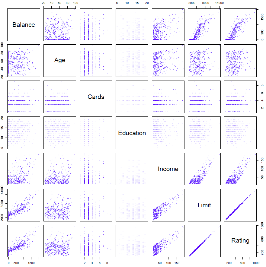
Figure 3.8
And so here’s a bunch of variables on credit cards and ratings. And we see the current balance on the credit card, the age, number of cards, and so on. These are all quantitative variables.
Back to Slide 27:
Hastie: Now in addition to these variables, we have some qualitative variables. So one of them is gender. So that take on values male and female. Student, so the student status of the cardholder, whether they are a students or not. So these are qualitative values. Marital status, say, married, single, or divorced. There’s no order really in those variables. They’re just different categories. And likewise, ethnicity. Say Caucasian, African-American, or Asian. Again, in no way an ordered variable. So how do we deal with such qualitative predictors when we’re fitting linear regression models?
Slide 29:
Hastie: So let’s consider an example on credit cards. Imagine investigating the difference in credit card balance between males and females, ignoring the other variables. So what we do is we do we create a new variable. Let’s call it \(x\). We call it \(x\). And the \(i\) value is going to be 1, if the \(i\)th person is a female, and a 0 if the \(i\)th person is a male.
\[x_i = \begin{cases}1 & \quad \text{if } ith \text{ person is female}\\ 0 & \quad \text{if } ith \text{ person is male}\\ \end{cases}\]So we’ve got a name for such a variable. We call it a dummy variable. It’s a created variable just to represent this categorical feature. So for each value of \(i\), we score an individual as 0 or 1, depending on if they’re male or female. And so now if we put such a variable in a model, let’s say on its own, we’ve got the linear regression model with a coefficient for this dummy variable, \(x_i\). And let’s see what it produces. Well, since \(x_i\) takes on only two possible values, 0 or 1, the model’s either going to be \(\beta_0 + \beta_1 + \epsilon\) if the person is female. And if the person is male, it’s just going to be \(\beta_0 + \epsilon\). So \(\beta_1\) is telling us the effect of being female versus the baseline, in this case, of being male. And so that’s how we deal with the categorical variable with just two levels.
Slide 30:
Hastie: So here we see the results of the regression model using just the single variable gender and the dummy variable 0, 1, the 1 representing female.
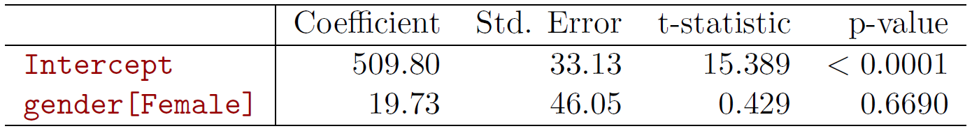
Figure 3.9
And so we see the result. And the coefficient is 19.73, but it’s not significant. The p value is 0.66, which is not significant. So contrary to popular wisdom, females don’t generally have a higher credit card balance than males. The number 19.73 is slightly higher, but it’s not significant.
Slide 31:
Hastie: So what do we do it if we have a variable with more than two levels? So ethnicity is such a variable. Well, we just make more dummy variables. So ethnicity has three levels. So we’ll make two dummy variables in this case, and we’ll call them \(x_1\) and \(x_2\). And so \(x_{i1}\) is the value for the \(i\)th individual for dummy variable one. We’ll call it a 1 if the \(i\)th person is Asian, otherwise 0. And the second dummy variable will be 1 if the \(i\)th person is Caucasian, and 0 if not. And of course if they’re both zero, the person, the individual, will be African-American. And so that’s the general rule if you’ve got a categorical variable with three levels, you make two dummy variables. If it’s got two levels, you make one dummy variable. And if it’s got \(k\) levels, you’ll make \(k - 1\) dummy variables to represent each of those categories.
Slide 32:
Hastie: So what does the model look like in this case? Well, we’ll have a model now with two coefficients, one for each of these dummy variables.
\[y_i = \begin{cases}\beta_0 + \beta_1 + \epsilon_i & \quad \text{if } ith \text{ person is Asian}\\ \beta_0 + \beta_2 + \epsilon_i & \quad \text{if } ith \text{ person is Caucasian} \\ \beta_0 + \epsilon_i & \quad \text{if } ith \text{ person is AA}\\ \end{cases}\]And let’s look at the different cases. So if the person’s Asian, they’ll get the \(\beta_1\). If the person’s Caucasian, they’ll get the \(\beta_2\). And if the person’s African American, they don’t have \(\beta_1\) or \(\beta_2\), so the baseline, \(\beta_0\), represents such an individual. And so what we see now is that \(\beta_1\) represents the difference between the baseline \(\beta_0\), which is African American, and the difference between that individual and an Asian. So it’s the additional effect for being an Asian, and \(\beta_2\) is an additional effect for being Caucasian. And as I said, there will be always one fewer dummy variable than the number of levels. So in this case, we call the category African-American is known as the baseline level, because it doesn’t have a parameter representing it except \(\beta_0\).
Slide 33:
Hastie: So here’s the linear model.
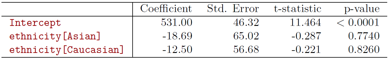
Figure 3.10
We’ve picked African-American as a baseline. And so that actually determines which comparisons we make. So the coefficient minus 18.69 is comparing Asian to African-American. And that’s not significant. And likewise, the Caucasian to African-American, which is also not significant. Now, it turns out the choice of the baseline does not take the foot of the model. The residual sum of squares would be the same no matter which category you chose as the baseline. But the contrasts would change, because picking the baseline determines which contrasts you make. And so the p values potentially would change as you change the baseline.
Interactions and Nonlinearity
Slide 32:
Hastie: So that’s one extension of the linear model. A number of extensions are interactions and non-linearity. We’ll talk about interactions first. So in our previous analysis with advertising data, we assumed that the effect on sales of increasing one advertising medium is independent of the amount spent on the other media. So for example, in the linear model, we’ve got TV, radio, newspaper.
\[\widehat{\text{sales}} = \beta_0 + \beta_1 \times \text{TV} + \beta_2 \times \text{radio} + \beta_3 \times \text{newspaper}\]It says that the average effect on sales of a one unit increase in TV is always \(\beta_1\) regardless of the amount spent on radio.
Slide 35:
Hastie: But suppose that spending money on radio advertising actually increases the effectiveness of TV advertising, so that the slope term for TV should increase as radio increases. So in this situation, suppose we’re given a fixed budget of $100,000, spending half on radio and half on TV may increase sales more than allocating the entire amount in either TV or to radio. So in marketing, this is known as a synergy effect, and in statistics, we often refer to it as an interaction effect.
Slide 36:
Hastie: So here’s a nice, pretty picture of the regression surface, sales as a function of TV and radio.
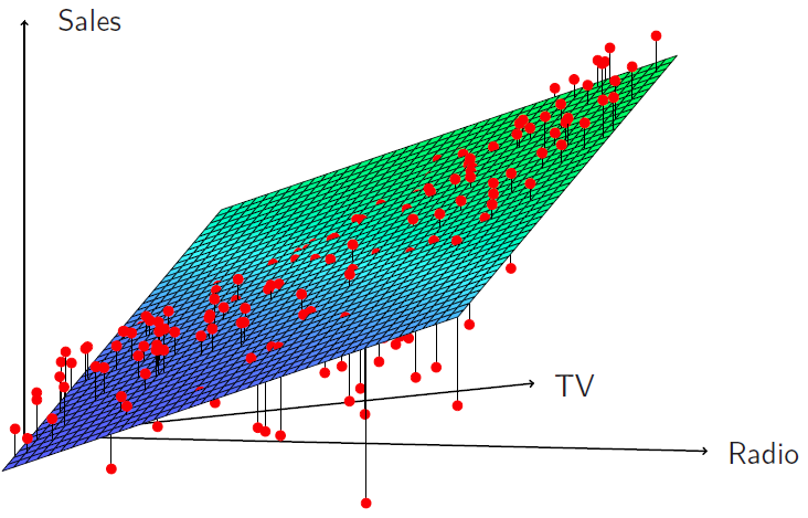
Figure 3.11
And we see that when the levels of either TV or radio are low, then the true sales are lower than predicted by the linear model. But when advertising is split between the two media, then model tends to underestimate sales. And you can see that by the way the points stick out of the surface at the two ends, or below the surface in the middle.
Slide 37:
Hastie: So how do we deal with interactions or include them in the model? So what we do is we put in product terms. So here we have a model where we have a term for TV and the term for radio, and then we put in a term that is the product of radio and TV.
\[\text{sales} = \beta_0 + \beta_1 \times \text{TV} + \beta_2 \times \text{radio} + \beta_3 \times (\text{radio} \times \text{TV}) + \epsilon\]So we literally multiply those two variables together, and call it a new variable, and put a coefficient on that variable. Now you can rewrite that model slightly, as we’ve done in the second line over here.
\[\text{sales} = \beta_0 + (\beta_1 + \beta_3 \times \text{radio}) \times \text{TV} + \beta_2 \times \text{radio}+ \epsilon\]And we’ve just collected terms slightly differently. And the way we’ve written it here is showing that by putting in this interaction, we can interpret it as the coefficient of TV, which had been originally \(\beta_1\), is now modified as a function of radio. So as the values of radio changes, the coefficient of TV changes by amount \(\beta_3\) times radio. So that’s a nice way of interpreting what this interaction is doing.
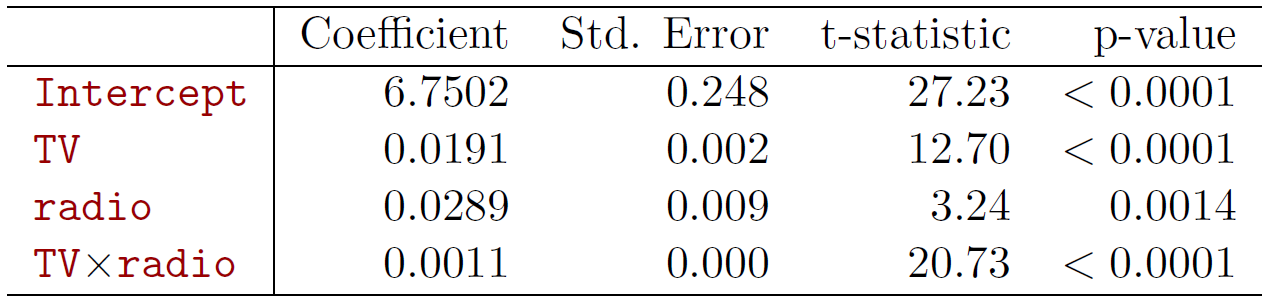
Figure 3.12
And if you look at a summary of the linear model below, indeed we see that the interaction is significant, which we might have guessed from the previous picture. So in this case, the interaction really is significant.
Slide 38:
Hastie: So the results in this table suggest that interactions are important. The p-value for the interaction is extremely low, so there’s strong evidence in favor of the alternative here, that beta three, which was the coefficient for interaction, is not 0. We can also look at the \(R^2\) for the model with interaction, and it’s jumped up to 96.8% compared to 89.7% by just adding this one extra parameter to the model. And we get that by adding an interaction between TV and radio.
Slide 39:
Hastie: Another way of interpreting this is that we have 69% of the variability in sales that remains off to fit in that it’s a model has it been explained by the interaction to because we went from 89.7 to 96.8 and if we think of that in terms of the fraction of unexplained variance, that 69% of unexplained variance.
\[\frac{96.8 - 89.7}{100 - 89.7} = 69\%\]The coefficient estimates in the table suggest that an increase in TV advertising of $1,000 is associated with an increased sales of– and we plug in the numbers for \(\beta_1\) and \(\beta_3\). It’s 19 plus 1.1 times radio units.
\[(\hat{\beta}_1 + \hat{\beta}_3 \times \text{radio}) \times 1000 = 19 + 1.1 \times \text{radio units}\]Alternatively, an increase in radio advertising of $1,000 will be associated with an increase in sales of– so now we’ve written it the other way around. We factored it the other way around, and now thinking of the coefficient of radio as changing as a function of TV, and it’ll be 29 plus 1.1 times TV units.
\[(\hat{\beta}_1 + \hat{\beta}_3 \times \text{TV}) \times 1000 = 29 + 1.1 \times \text{TV units}\]So you can make either of those interpretations when you put an interaction in the model.
Slide 40:
Hastie: Sometimes it’s the case that an interaction term has a very small p-value, but the associated main effects– in this case, TV and radio– do not. But when we put an interaction in, we tend to leave in the main effects, and we call this the hierarchy principle. And so there it’s stated if we put in an interaction, we put in the main effects, even if the p-values associated with the coefficients are not significant.
Slide 41:
Hastie: So why do we do this? It’s just that interactions are hard to interpret in a model without main effects– their mean: actually changes, and so it’s just generally not a good practice. Another way of saying this is that the interaction term also contains main effects, even if you fit the model with no main effect terms. So it just becomes more cumbersome to interpret.
Slide 42:
Hastie: Now what if we want to put in the interactions between a qualitative and a quantitative variable? Turns out thats actually easier to interpret, and we’ll see that now. So let’s look at the credit card data set again, and let’s suppose we’re going to predict balance, as before, and we’re going to use income, which is a quantitative variable, and student status, which is qualitative. And so we’ll have a dummy variable for student, which will be 1 if the person’s a student, otherwise a 0. So without an interaction, the model looks like this.
\[\text{balance}_i \approx \beta_0 + \beta_1 \times \text{income}_i + \begin{cases}\beta_2 & \quad \text{if } ith \text{ person is a student}\\ 0 & \quad \text{if } ith \text{ person is not a student}\\ \end{cases}\]And we see we’ve got an intercept, we’ve got a coefficient for income, and then we’re going to have \(\beta_2\) is the person is a student, and 0 if the person’s not a student. And another way to write that is a coefficient on income, and we just lump together the intercept and the dummy variable for student.
\[\text{balance}_i = \beta_1 \times \text{income}_i + \begin{cases} \beta_0 + \beta_2 & \quad \text{if } ith \text{ person is a student}\\ \beta_0 & \quad \text{if } ith \text{ person is not a student}\\ \end{cases}\]And by grouping them like that, we can think of this as having a common slope in income, but a different intercept depending on whether the person is a student or not. And if a person as a student, the intercept is \(\beta_0 + \beta_2\), and if the person’s not a student, it’s just \(\beta_0\). So that’s without an interaction.
Slide 43:
Hastie: With interactions in the model, it takes the following form,
\[\text{balance}_i \approx \beta_0 + \beta_1 \times \text{income}_i + \begin{cases} \beta_2 + \beta_3 \times \text{income}_i & \quad \text{if student}\\ 0 & \quad \text{if not student}\\ \end{cases}\]but before we study this, let’s just look at a picture of these two situations, because that’ll make things clear.
Slide 44:
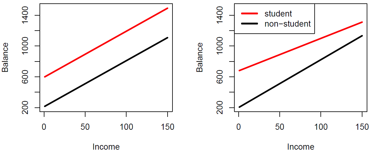
Figure 3.13
Hastie: So in the left panel, we’ve got no interaction, and we see very clearly that there is a common slope for whether you’re a student or not, but just the intercept changes. But if you put an interaction between the slop of income and student status, you’re going to get both a different industry and the different slope. And so that makes it really simple explanation in this case.
Back to Slide 43:
Hastie: And if we look at the actual model, it looks like this. So we can write it in several different ways. And so this second term over here is showing us what happens with the interaction. And so, if you’re a student, you get both a different intercept– that’s \(\beta_2\)– and you get a different slope on income– which is \(\beta_3\). And if you’re not a student, there’s 0, which means you get the baseline intercept and slope. And you can rearrange those terms in the following fashion and it’s telling you the same thing.
\[\text{balance}_i = \begin{cases} (\beta_0 + \beta_2) + (\beta_1 + \beta_3) \times \text{income}_i & \quad \text{if student}\\ \beta_0 + \beta_1 \times \text{income}_i & \quad \text{if not student}\\ \end{cases}\]So the interpretation of interactions with categorical variables and the associated dummy variables is more simple than even in the quantitative case.
Slide 45:
Hastie: The other modification of the linear model is what if we want to include nonlinear effects? So here we’ve got the plot of two of the variables in the auto data set.
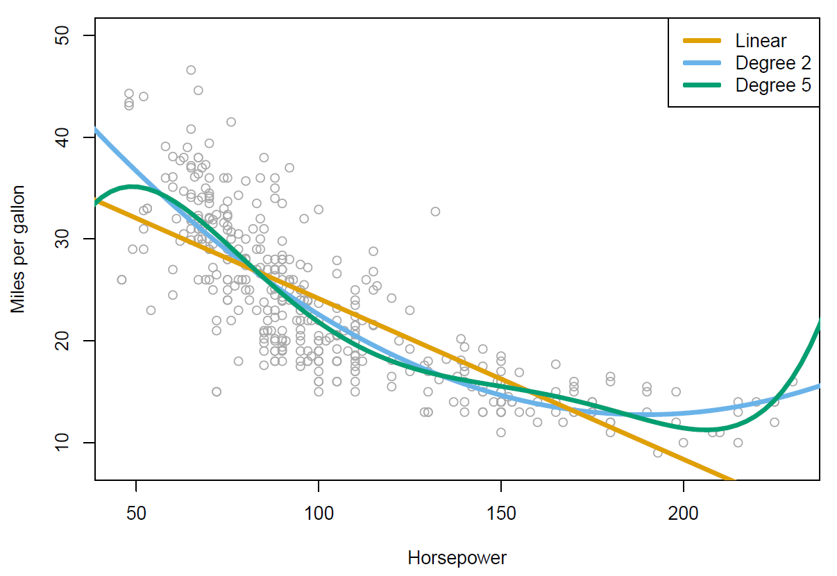
Figure 3.14
So we’ve got miles per gallon against horsepower, and we’ve included three fitted models here. We’ve got the linear regression model, which is the orange curve over here. And you can see it’s not quite capturing the structure in the data. And so to improve on that, what we’ve actually done is fit two polynomial models. We’ve fit a quadratic model, which is the blue curve, and you can see that beta captures the curvature in the data than the linear model. And then we’ve also fitted a degree five polynomial, and that one looks rather wiggly. So we have an ability to fit models of different complexity, in this case, using polynomials.
Slide 46:
Hastie: And these are very easy to do. So just like we created an artificial dummy variable for categorical variables, we can make extra variables to accommodate polynomials. So we make a variable horsepower squared, which we just include in our data set, and now we fit a linear model with the coefficient for horsepower, and a coefficient for horsepower squared. And of course that’s a polynomial expression, and we’ll notice that that improves the fit.
\[\text{mpg} = \beta_0 + \beta_1 \times \text{horsepower} + \beta_2 \times \text{horsepower}^2 + \epsilon\]We do the summary, and we see that the coefficient of both horsepower and horsepower squared are strongly significant.
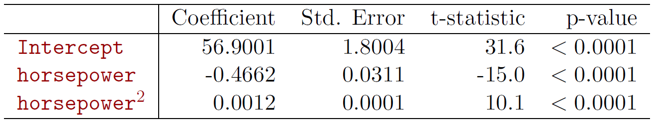
Figure 3.15
And so you can do this, you can add a cubic term as well, and in the previous example, we went all the way up to a polynomial of degree five. So that’s a very easy way of allowing for nonlinearities in a variable, and still use linear regression. We still call it a linear model, because it’s actually linear in the coefficients. But as a function of the variables, it’s become nonlinear. But the same technology can be used to fit such models. So that expands the scope of linear regression enormously.
Slide 47:
Hastie: OK so we’ve reached the end of the session. If you’re reading along in the chapter, you’ll see there’s some topics we didn’t cover. We didn’t cover outliers. There’s non-constant variance of the error terms. High leverage points, which means if you’ve got points of observations in \(x\) that really stick out far from the rest of the crowd, what effect they have on the model. And colinearity, if you have variables that are very correlated with each other, what happens if you include them in the model. So we’re not going to cover those here, but they’re covered in some detail in the book, and if you look at section 3.33, you’ll find coverage on that.
Slide 48 :
Hastie: OK, so that finishes our coverage of linear models. There are a lot of generalizations of linear model, and as I’ve hinted at already, you’ll see it’s actually quite a powerful framework. So we used similar technology for classification problems, and that will be discussed in next. So we’ll be doing logistic regression and support vector machines, which also have linear models underneath the hood, but expand the scope greatly of linear models. And then we’ll cover non linearity. So we’ll talk about techniques like kernel smoothing, and splines, and generalized additive models, some of which are also just extensions of linear models, and some of which are richer form of modelling that are for non-linearities in a more flexible way. We covered some simple interactions in linear models here, but we’ll talk about much more general techniques for dealing with interactions in a much more systematic way. And so there we’ll cover tree-based methods, and then some of the state-of-the-art techniques, such as bagging, random forests, and boosting, and these also captured non-linearities. And these really bring our bag of tools up to what we call state-of-the-art. And then another important class of methods we will discuss use what’s known as regularized fitting. And so these include ridge regression and lasso. And these have become very popular lately, especially when we have data sets where we have very large numbers of variables– so-called wide data sets, and even linear models are too rich for them, and so we need to use methods to control the variability. And so that’s all still to come, and so we have lots of nice things to look forward to.