⇦ Back to Resources
Lesson 2 - Videos
Statistical Learning and Regression
Slide 1:
Hastie: OK, we’re going to talk about statistical learning and models now. I’m going to tell you what models of good for, how we use them, and what are some of the issues involved. OK so we see three plots in front of us. These are sales figures from a marketing campaign as a function of amount spent on TV ads, radio ads, and newspaper ads.
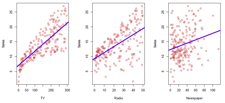
Figure 2.1– Linear regressions of Sales vs. TV, Radio, Newspaper
And you can see at least in the first two there’s somewhat of a trend. And, in fact, we’ve summarized the trend by a little linear regression line in each. And so we see that there’s some relationship. The first two, again, look stronger than the third. Now, in a situation like this, we typically like to know the joint relationship between the response sales and all three of these together. We want to understand how they operate together to influence sales. So you can think of that as wanting to model sales as a function of TV, radio, and newspaper all jointly together. So how do we do that?
Slide 2:
Hastie: So before we get into the details let’s set up some notation. So here, sales are the response, or the target, that we wish to predict or model. And we usually refer to it as \(Y\). We use the letter \(Y\) to refer to it. TV is one of the features or inputs or predictors, and we’ll call it \(X_{1}\). Likewise, radio is \(X_{2}\) and so on. So in this case, we’ve got three predictors, and we can refer to them collectively by a vector as \(X\) equal to, with three components:
\[X = \begin{pmatrix} X_{1}\\ X_{2}\\ X_{3} \end{pmatrix}\]And vectors we generally think of as column vectors. And so that’s a little bit of notation. And so now in this small compact notation, we can write our model as \(Y\) equals function of \(X\) plus error.
\[Y = f(X) + \epsilon\]OK and this error, it’s just a catch all. It captures the measurement errors maybe in \(Y\) and other discrepancies. Our function of \(X\) is never going to model \(Y\) perfectly. So there’s going to be a lot of things we can’t capture with the function. And that’s caught up in the error. And, again, \(f(X)\) here is now a function of this vector \(X\) which has these three arguments, three components.
Slide 3:
Hastie: So what is the function \(f(X)\) good for? So with a good \(f\), we can make predictions of what new points \(X\) equals to little \(x\). So this notation \(X = x\). You know, capital \(X\), we think as the variable, having these three components. And little \(x\) is an instance also with three components, particular values for newspaper, radio, and TV. With the model we can understand which components of \(X\)– in general, it’ll have P components, if there’s P predictors– are important in explaining \(Y\), and which are irrelevant. For example, if we model in income as a function of demographic variables, seniority and years of education might have a big impact on income, but marital status typically does not. And we’d like our model to be able to tell us that. And depending on the complexity of \(f\), we may be able to understand how each component \(X_{j}\) affects \(Y\), in what particular fashion it affects \(Y\). So models have many uses and those amongst them.
Slide 4:
Hastie: OK, well, what is this function \(f\)? And is there an ideal \(f\)? So in the plot, we’ve got a large sample of points from a population. There is just a single \(X\) in this case and a response \(Y\).
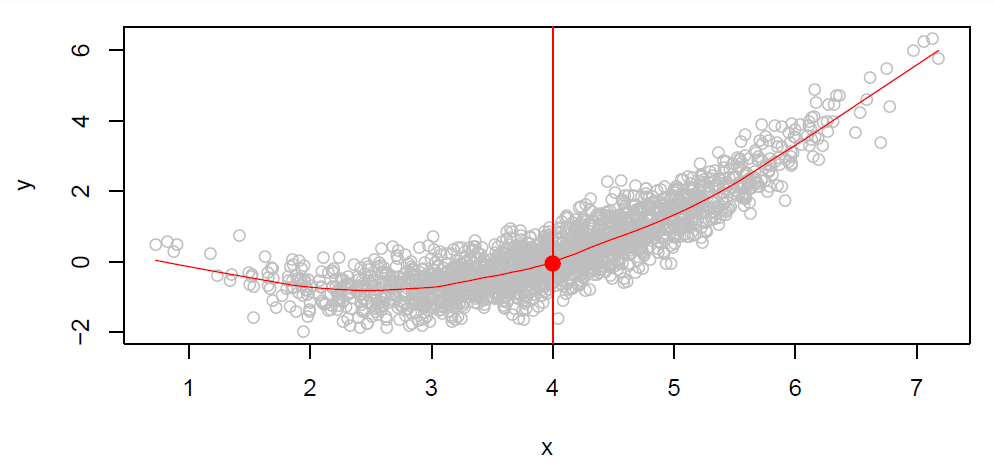
Figure 2.2
And you can see, it’s a scatter plot, so we see there are a lot of points. There are 2,000 points here. Let’s think of this as actually the whole population or rather as a representation of a very large population. And so now let’s think of what a good function \(f\) might be. And let’s say not just the whole function, but let’s think what value would we like \(f\) to have at say the value of \(X = 4\). So at this point over here. We want to query \(f\) at all values of \(X\). But we are wondering what it should be at the value 4. So you’ll notice that at the \(X = 4\), there are many values of \(Y\). But a function can only take on one value. The function is going to deliver back one value. So what is a good value? Well, one good value is to deliver back the average values of those \(Y\)’s who have \(X = 4\). And that we write in this sort of math-y notation over here that says the function at the value 4 is the expected value of \(Y\) given \(X = 4\).
\[f(4) = E(Y|X = 4)\]And that expected value is just a fancy word for average. It’s actually a conditional average given \(X = 4\). Since we can only deliver one value of the function at \(X = 4\), the average seems like a good value. And if we do that at each value of \(X\), so at every single value of \(X\), we deliver back the average of the \(Y\)’s that have that value of \(X\). Say, for example, at \(X = 5\), again, we want to have the average value in this little conditional slice here. That will trace out this little red curve that we have. And that’s called the regression function. So the regression function gives you the conditional expectation of \(Y\) given \(X\) at each value of \(X\). So that, in a sense, is the ideal function for a population in this case of \(Y\) and a single \(X\).
Slide 5:
Hastie: So let’s talk more about this regression function. It’s also defined for a vector \(X\). So if \(X\) has got three components, for example, it’s going to be the conditional expectation of \(Y\) given the three particular instances of the three components of \(X\).
\[f(x) = f(x_1,x_2,x_3) = E(Y|X_1 = x_1, X_2 = x_2, X_3 = x_3)\]So if you think about that, let’s think of \(X\) as being two dimensional because we can think in three dimensions. So let’s say \(X\) lies on the table, two dimensional \(X\), and \(Y\) stands up vertically. So the idea is the same. We’ve got a whole continuous cloud of \(Y\)’s and \(X\)’s. We go to a particular point \(X\) with two coordinates, \(X_1\) and \(X_2\), and we say, what’s a good value for the function at that point? Well, we’re just going to go up in the slice and average the \(Y\)’s above that point. And we’ll do that at all points in the plane. We say that’s the ideal or optimal predictor of \(Y\) with regard for the function. And what that means is actually it’s with regard to a loss function. What it means is that particular choice of the function \(f(x)\) will minimize the sum of squared errors. Which we write in this fashion, again, expected value of \(Y\) minus \(g\) of \(X\) of all functions \(g\) at each point \(X\).
\[E[(Y - g(X))^2|X = x]\]So it minimizes the average prediction errors. Now, at each point \(X\), we’re going to make mistakes because if we use this function to predict \(Y\). Because there’s lots of \(Y\)’s at each point \(X\). Right? And so the areas that we make, we call, in this case, them epsilons. And those are the irreducible error. You might know the ideal function \(f\), but, of course, it doesn’t make perfect predictions at each point \(X\). So it has to make some errors. But, on average, it does well. For any estimate \(\hat{f}(x)\). And that’s what we tend to do. We tend to put these little hats on estimators to show that they’ve been estimated from data. And so \(\hat{f}(x)\) is an estimate of \(f(x)\), we can expand the squared prediction error at \(X\) into two pieces. There’s the irreducible piece which is just the variance of the errors. And there’s the reducible piece which is the difference between our estimate, \(\hat{f}(x)\), and the true function, \(f(x)\). OK. And that’s a squared component.
\[E[(Y - \hat{f}(X))^2|X = x] = \underbrace{[f(x) - \hat{f}(x)]^2}_{\textit{Reducible}} + \underbrace{Var(\epsilon)}_{\textit{Irreducible}}\]So this expected prediction error breaks up into these two pieces. So that’s important to bear in mind. So if we want to improve our model, it’s this first piece, the reducible piece that we can improve by maybe changing the way we estimate \(f(x)\).
Slide 6:
Hastie: OK, so that’s all nice. This is a kind of, up to now, has been somewhat of a theoretical exercise. Well, how do we estimate the function \(f\)? So the problem is we can’t carry out this recipe of conditional expectation or conditional averaging exactly because at any given \(X\) in our data set, we might not have many points to average. We might not have any points to average.
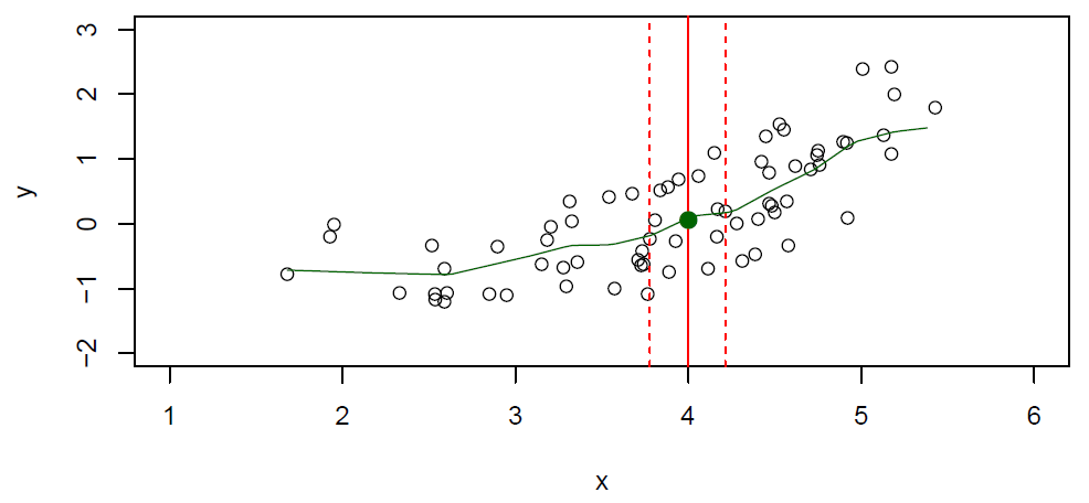
Figure 2.3– With fewer points, we use a neighborhood
In the figure, we’ve got a much smaller data set now. And we’ve still got the point \(X = 4\). And if you look there, you’ll see carefully that the solid point is one point up, I put on the plot, the solid green point. There’s actually no data points whose \(X\) value is exactly 4. So how can we compute the conditional expectation or average? Well, what we can do is relax the idea of at the point \(X\) to in a neighborhood of the point \(X\). And so that’s what the notation here refers to. \(N(x)\) is a neighborhood of points defined in some way around the target point which is this \(X = 4\) here.
\[\hat{f}(x) = Ave(Y|X \in N(x))\]And it keeps the spirit of conditional expectation. It’s close to the target point \(x\). And if we make that neighborhood wide enough, we’ll have enough points in the neighborhood to average. And we’ll use their average to estimate the conditional expectation. So this is called nearest neighbors or local averaging. It’s a very clever idea. It’s not my idea. It has been invented long time ago. And, of course, you’ll move this neighborhood, you’ll slide this neighborhood along the x-axis. And as you compute the averages, as you slide in along, it’ll trace out a curve. So that’s actually a very good estimate of the function \(f\). It’s not going to be perfect because the little window, it has a certain width. And so as we can see, some points of the true \(f\) may be lower and some points higher. But on average, it does quite well. So we had a pretty powerful tool here for estimating this conditional expectation, just relax the definition, and compute the nearest neighbor average. And that gives us a fairly flexible way of footing a function. We’ll see in the next section that this doesn’t always work, especially as the dimensions get larger. And we’ll have to have ways of dealing with it.
Curse of Dimensionality and Parametric Models
Slide 7:
Hastie: OK, here we are going to see situations where our nearest neighbor averaging doesn’t work so well. And we’re going to have to the find ways to deal with that. Nearest neighbor averaging, which is the one we just saw, can be pretty good for small \(p\), small numbers or variables. Here we had just one variable. But small, maybe \(p \leq 4\) and larg-ish \(N\). Large \(N\) so that we have enough points in each neighbor to average to give us our estimate. Now this is just one version of a whole class of techniques called smoothers. And we’re going to discuss later on in this course much cleverer ways of doing this kind of averaging such as kernel and spline smoothing. Now there’s a problem though. Nearest neighbor methods can be really lousy when \(p\) is large. And the reason has got the name the curse of dimensionality. What it boils down to is that nearest neighbors tend to be far away in high dimensions. So and that creates a problem. We need to get a reasonable fraction of the \(N\) values of \(y_i\) to average to bring the variance down. So we need to average the number of points in each neighborhood so that our estimate has got a nice, reasonably small variance. And let’s suppose we want 10% of the data points to be in each interval. The problem is that 10% neighborhood in high dimensions need no longer be local. So we lose the spirit of estimating the conditional expectation by local averaging.
Slide 8:
Hastie: So let’s look at a little example of that.
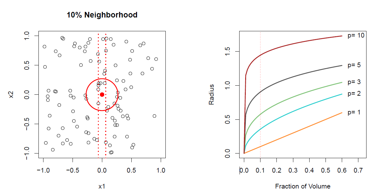
Figure 2.4– The curse of dimensionality
In the left panel, we’ve got values of two variables, \(x_1\) and \(x_2\). And they are actually uniformly distributed in this little cube with edges -1 to +1, -1 to +1. And we form two 10% neighborhoods in this case. The first neighborhood is just involving the variable \(x_1\) ignoring \(x_2\). And so that’s indicated by the vertical dotted lines. Our target point is at 0. And so we spread out a neighborhood to the left and right until we capture 10% of the data points with respect to the variable \(x_1\). And the dotted line indicates the width of the neighborhood. Alternatively, if we want to find a neighborhood in two dimensions, we spread out a circle centered at the target point, which is the red dot there, until we’ve captured 10% of the points. Now notice the radius of the circle in two dimensions is much bigger than the radius of the circle in one dimension which is just the width between these two dotted lines. And so to capture 10% of the points in two dimensions, we have to go out further and so we are less local than we are in one dimension. And so we can take this example further. And on the right hand plot, I’ve shown you how far you have to go out in one, two, three, five, and 10 dimensions. In 10 dimensions, these are different versions of this problem as the dimensions get higher In order to capture a certain fraction of the volume. OK, and so take, for example, 10% or 0.1 fraction of the volume. So for p equals 1, if the data is uniform, you roughly go out 10% of the distance. In two dimensions, we store you went more. Look what happens in five dimensions. In five dimensions, you have to go out to about 0.9 on each coordinate axes to get 10% of the data. That’s just about the whole radius of this sphere. And in 10 dimensions, you actually have to go break out of this sphere in order to get points in the corner to capture the 10%. So the bottom line here is it’s really hard to find new neighborhoods in high dimensions and stay local. If this problem didn’t exist, we would use the near neighbor averaging as the sole basis for doing estimation.
Slide 9:
Hastie: So how do we deal with this? Well, we introduce structure to our models. And so the simplest structural model is a linear model. And so here we have an example of a linear model.
\[f_L(X) = \beta_0 + \beta_1X_1 + \beta_2X_2 +\dots\beta_pX_p\]We’ve got \(p\) features. It’s just got \(p + 1\) parameters. And it says the function of \(X\), we can approximate by a linear function. So there’s a coefficient on each of the \(X\)’s and at intercept. So that’s one of the simplest structural models. We can estimate the parameters of the model by fitting the model to training data. And we’ll be talking more about how you do that. And when we use such a structural model, and, of course, this structural model is going to avoid the curse of dimensionality. Because it’s not relying on any local properties and nearest neighbor averaging. That’s just fitting quite a rigid model to all the data. Now a linear model is almost never correct. But it often serves as a good approximation, an interpretive approximation to the unknown true function \(f(X)\).
Slide 10:
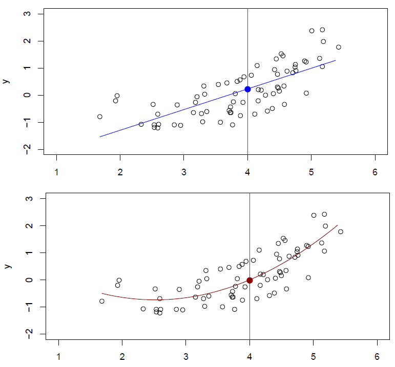
Figure 2.5– Top plot: \(\hat{f}_L(X) = \hat{\beta}_0 + \hat{\beta}_1X\) \n Bottom plot: \(\hat{f}_Q(X) = \hat{\beta}_0 + \hat{\beta}_1X + \hat{\beta}_2X^2\)
Hastie: So here’s our same little example data set. And we can see in the top plot, a linear model gives a reasonable fit to the data, not perfect. In the bottom plot, we’ve augmented our linear model. And we’ve included a quadratic term. So we put in our \(X\), and we put in an \(X^2\) as well. And we see that fits the data much better. It’s also a linear model. But it’s linear in some transformed values of \(X\). And notice now we’ve put hats on each of the parameters, suggesting they’ve been estimated, in this case, from this training data. These little hats indicate that they’ve been estimated from the training data. So those are two parametric models, structured models that seem to do a good job in this case.
Slide 11:
Hastie: Here’s a two dimensional example. Again, seniority, years of education, and income. And this is simulated data.
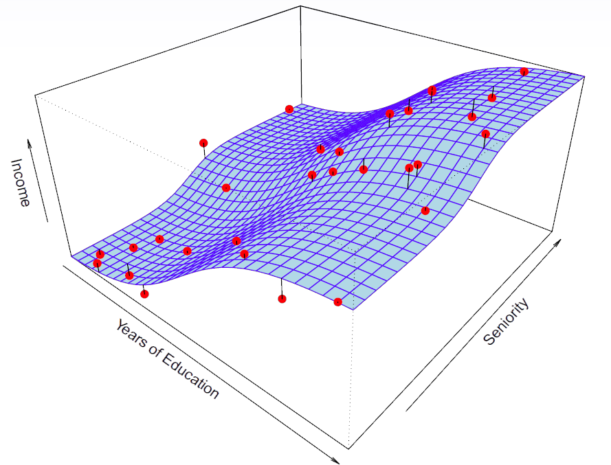
Figure 2.6– \(\text{income} = f(\text{education, seniority})+ \epsilon\)
And so the blue surface is actually showing you the true function from which the data was simulated with errors. We can see the errors aren’t big. Each of those data points comes from a particular pair of years of education and seniority with some error. And the little line segments in the data points show you the error. OK. So we can write that as income as a function of education and seniority plus some error. So this is with truth. We actually know this in this case.
Slide 12:
Hastie: And here is a linear regression model fit to those simulation data.
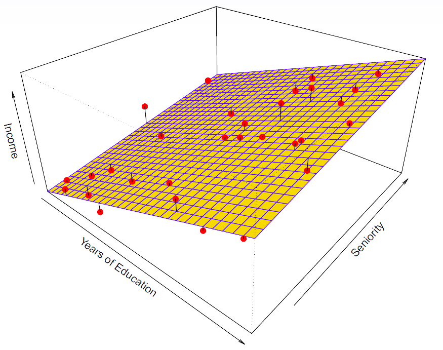
Figure 2.7
So it’s an approximation. It captures the important elements of the relationship but doesn’t capture everything. OK. It’s got three parameters.
Slide 13:
Hastie: Here’s a more flexible regression model. We’ve actually fit this using a technique called thin plate splines. And that’s a nice smooth version of a two dimensional smoother.
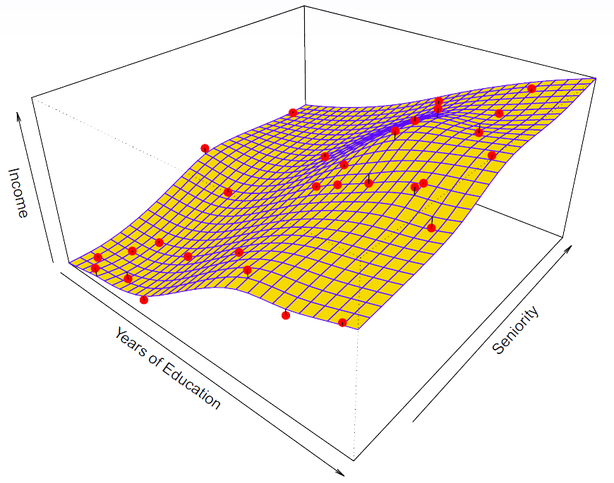
Figure 2.8– Thin plate spline
It’s different from nearest neighbor averaging. It’s got some nicer properties. And you can see this does a pretty good job. If we go back to the generating data and the generating surface, this thin plate spline actually captures more of the essence of what’s going on there. And for thin plate splines, we’re going to talk about them later in Chapter 7. There’s a tuning parameter that controls how smooth the surfaces is.
Slide 14:
Hastie: Here’s another example of a thin plate spline.
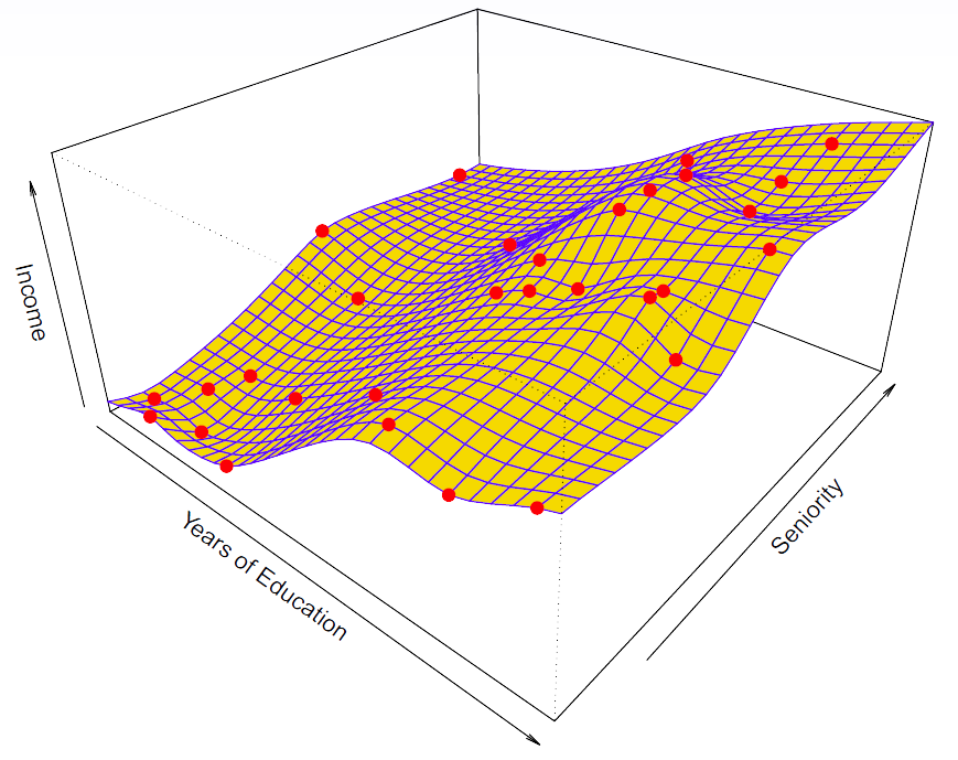
Figure 2.9– Thin plate spline with no errors on the training data
We basically tuned the parameter all the way down to 0. And this surface actually goes through every single data point. In this case, that’s overfitting. The data, we expect to have some errors. Because with true function generate data points with errors. So this is known as overfitting. We are overfitting the training data. So this is an example where we’ve got a family of functions, and we’ve got a way of controlling the complexity.
Slide 15:
Hastie: So there are some tradeoffs when building models. One trade off is prediction accuracy versus interpretability. So linear models are easy to interpret. We’ve just got a few parameters. Thin plate splines are not. They give you a whole surface back. And if given a surface back in 10 dimensions, it’s hard to understand what it’s actually telling you. We can have a good fit versus over-fit or under-fit. So in this previous example, the middle one was a good fit. The linear was slightly under-fit. And the last one was over-fit. So how do we know when the fit is just right? We need to be able to select amongst those. Parsimony versus black-box. Parsimony means having a model that’s simpler and can be transmitted with a small number of parameters and explained in a simple fashion, involved, maybe, in a subset of the predictors. And so those models if they do as well as say a black-box predictor, like the thin plate spline was somewhat of a black-box predictor. We’d prefer the simpler model.
Slide 16:
Hastie: Here’s a little schematic which shows a variety of the methods that we are going to be discussing in this course. And they are ordered by interpretability and flexibility.
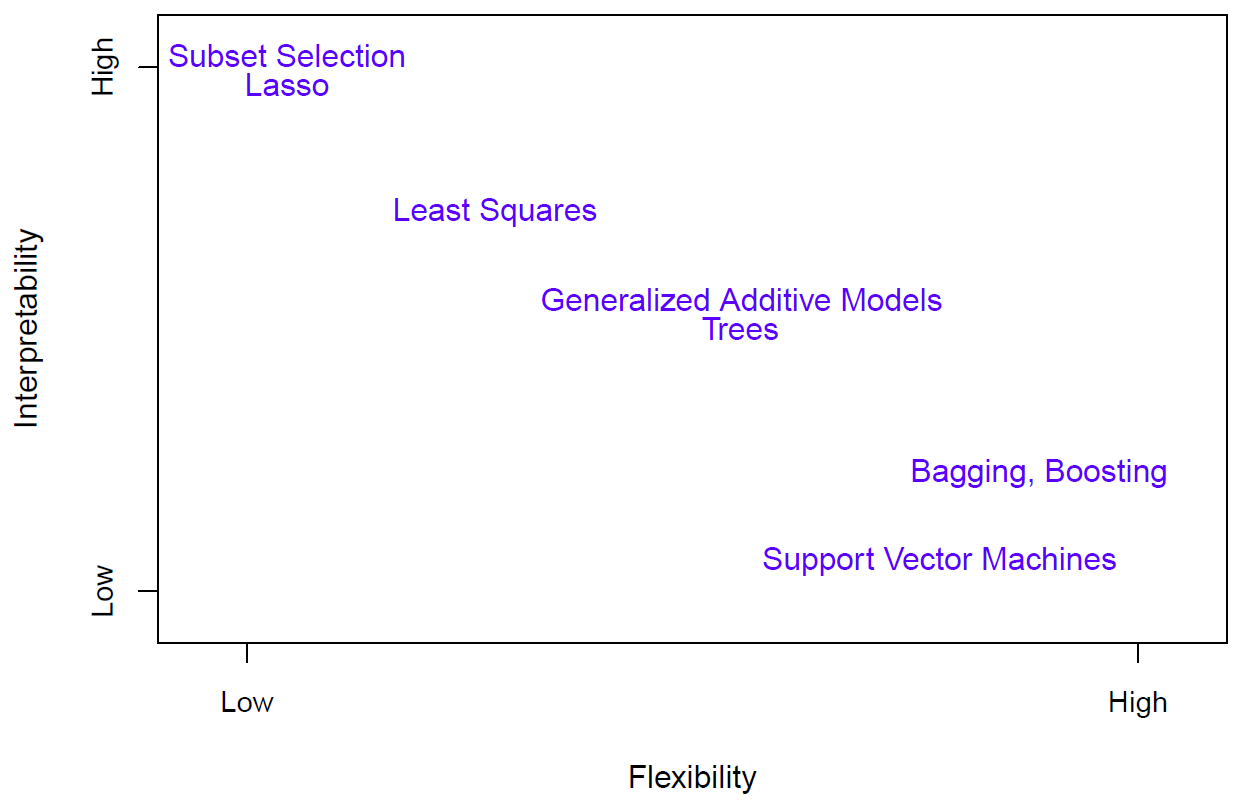
Figure 2.10
And at the top, there are two versions of linear regression, subset selection and lasso, which we’ll talk about, that actually even think the linear regression models too complex and try and reduce it by throwing out some of the variables. Linear models and least squares. Slightly more flexible, but you lose some interpretability because now all the variables are thrown in. Then we have generalized additive models which allow for transformations in an automatic way of each of the variables. And then at the high flexibility, low interoperability, and bagging, boosting, and support vector machines. We’ll discuss all these techniques but later on in the course. OK, so we covered linear regression. And we covered nearest neighbor averaging. And we talked about ways, places where that’s not going to work. And so we’ve briefly introduced a number of other different methods. And they are all listed on the screen, different methods that they can use to solve the problem when the dimensions are high and when linearity doesn’t work. But we have to choose amongst these methods. And so we need to develop ways of making those choices. And that’s what we’re going to cover in the next segment.
Assession Model Accuracy and Bias-Variance Trade-off
Slide 17:
Hastie: OK, so we’ve seen a variety of different models, from linear models, which are rather simple and easy to work with and interpret, to more complex models like nearest neighbor average and thin plate splines. And we need to know how to decide amongst these models. And so we need a way of assessing model accuracy, and when is a model adequate? And when may we improve it? OK, so suppose we have a model, \(\hat{f}(x)\), that’s been put through some training data. And we’ll denote the training data by Tr. And that consists of \(n\) data pairs, \(x_i, y_i\).
\[\textbf{Tr} =\{x_i,y_i\}\begin{smallmatrix} N\\ 1 \end{smallmatrix}\]And remember, the notation of \(x_i\) means the \(i\)-th observation, and \(x\) may be a vector. So it may have a bunch of components. \(y_i\) is typically a single \(y\), a scalar. And we want to see how well this model performs. Well, we could compute the average squared prediction error over the training data. So that means we take our \(y\), observe \(y\). We subtract from it \(\hat{f}(x)\). We square the difference to get rid of the sign. And we just average those over all the training data.
\[\text{MSE}_{\textbf{Tr}} = \text{Ave}_{i\in\textbf{Tr}}[y_i - \hat{f}(x_i)]^2\]Well, as you may imagine, this may be biased towards more overfit models. We saw with that thin plate spline, we could fit the training data exactly. We could make this mean squared error sub train, we could make it zero. Instead, we should, if possible, compute it using a fresh test data set, which we’ll call Te. So that’s an additional, say, \(M\) data pairs \(x_i, y_i\) different from the training set. And then we compute the similar quantity, which we’ll call mean squared error sub Te.
\[\text{MSE}_{\textbf{Te}} = \text{Ave}_{i\in\textbf{Te}}[y_i - \hat{f}(x_i)]^2\]And that may be a better reflection of the performance of our model.
Slide 18:
Hastie: OK, so now I’m going to show you some examples. We go back to one dimensional function fitting.
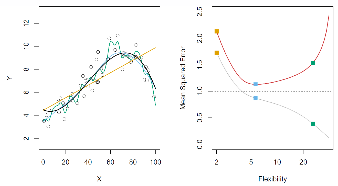
Figure 2.11– Left: Black curve is truth
Right: Red curve is \(\text{MSE}_{\textbf{Te}}\), Grey curve is \(\text{MSE}_{\textbf{Tr}}\)
In the left hand panel, we see the black curve, which is actually simulated. So it’s a generating curve. That’s the true function that we want to estimate. The points are data points, generated from that curve with error. And then we actually see– you have to look carefully in the plot– we see three different models fit to these data. There’s the orange model, the blue model, and the green model. And they’re ordered in complexity. The orange model is a linear model. The blue model is a more flexible model, maybe some kind of spline, one dimensional version of the thin plate spline. And then the green one is a much more flexible version of that. You can see it gets closer to the data. Now since this is a simulated example, we can compute the mean squared error on a very large population of test data. And so in the right hand plot, we plot the mean squared error for this large population of test data. And that’s the red curve. And you’ll notice that it starts off high for the very rigid model. It drops down and becomes quite low for the in between model. But then for the more flexible model, it starts increasing again. Of course, the mean squared error on the training data– that’s the grey curve– just keeps on decreasing. Because the more flexible the model, the closer it gets to the data point. But for the mean squared error on the test data, we can see there’s a magic point, which is the point at which it minimizes the mean squared error. And in this case, that’s this point over here at flexibility = 5. And it turns out its pretty much spot on for the medium flexible model in this figure. And if you look closely at the plot, you will see that the blue curve actually gets fairly close to the black curve. OK. Again, because this is a simulation model, the horizontal dotted line is the mean squared error that the true function makes for data from this population. And of course, that is the irreducible error, which we call the variance of epsilon.
Slide 19:
Hastie: Here’s another example of the same kind. But here, the two functions are actually very smooth.
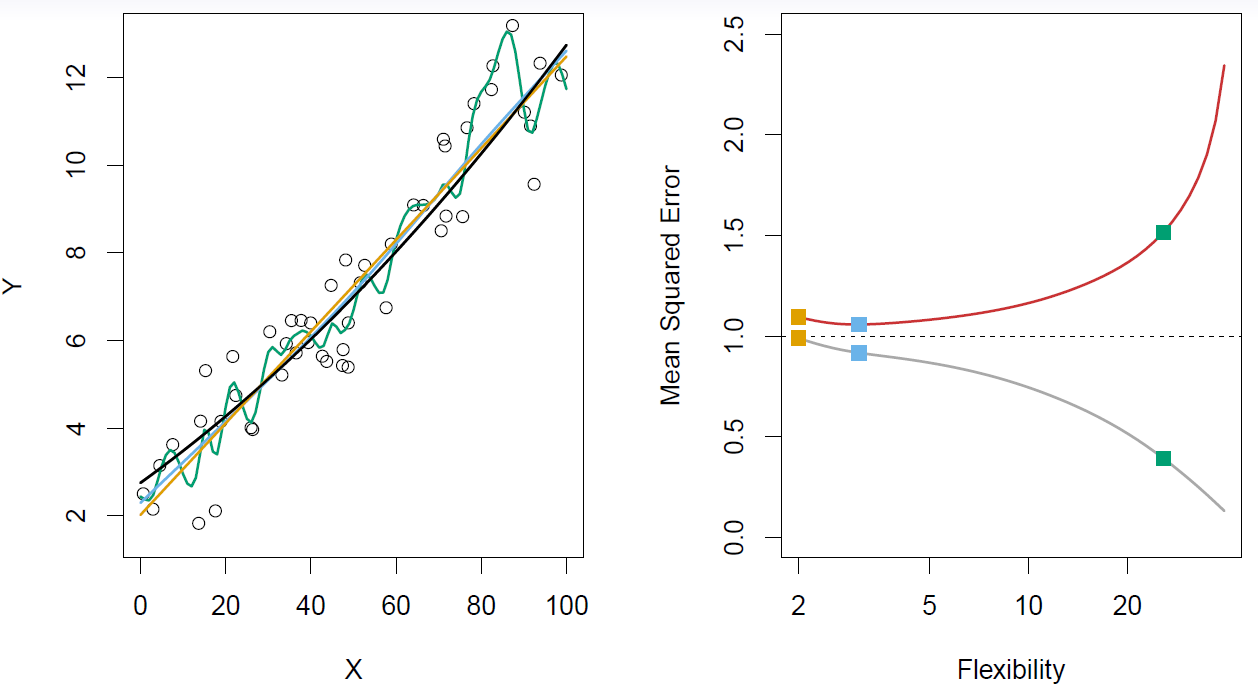
Figure 2.12– The truth is smoother, so the smoother fit and linear model do well
Same setup. Well, now we see that the mean squared error, the linear model does pretty well. The best model is not much different from the linear model. And the wiggly one, of course, is overfitting again and so it’s making big prediction errors. The training arrow, again, keeps on going down.
Slide 20:
Hastie: And finally, here’s quite a wiggly true function on the left.
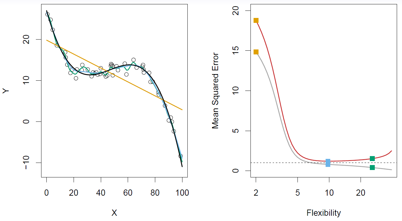
Figure 2.13– The truth is wiggly, so the more flexible fits do well
The linear model does a really lousy job. The most flexible model does about the best. The blue model and the green model are pretty good, pretty close together, in terms of the mean squared error on the test data. So I think this drums home the point. Again, the training mean squared error just keeps on going down. So this drums home the point that if we want to have a model that has good prediction error– and that’s measured here in terms of mean squared prediction error on the test data– we’d like to be able to estimate this curve. And one way you can do that, the red curve. You can do that is to have a hold our test data set, that you can value the performance of your different models on the test data set. And we’re going to talk about ways of doing this later on in the course.
Slide 21:
Hastie: I want to tell you about one aspect of this, which is called a bias-variance trade-off. So again, we’ve got \(\hat{f}(x)\), which is fit to the training data, Tr. And let’s say \(x_0, y_0\) is a test observation drawn from the population. And we’re going to evaluate the model at the single test observation, OK? And let’s suppose the true model is given by the function \(f\) again, where \(f\) is the regression function or the conditional expectation in the population. So let’s look at the expected prediction error between \(\hat{f}(x_0)\).
\[E(y_0 - \hat{f}(x_0))^2 = \text{Var}(\hat{f}(x_0)) + [\text{Bias}(\hat{f}(x_0))]^2 + \text{Var}(\epsilon)\]So that’s the predicted model. The fitted model on the training data evaluated at the new point \(x_0\). And see what the expected distance is from the test point, \(y_0\). So this expectation averages over the variability of the new \(y_0\), as well as the variability that went into the training set used to build \(\hat{f}\). So it turns out that we can break this. We can break up this expression into three pieces exactly. The one piece is again the irreducible error that comes from the random variation in the new test point, \(y_0\), about the true function \(f\). But these other two pieces break up the reducible part of the error, what we called the reducible part before, into two components. One is called the variance of \(\hat{f}\), Var\((\hat{f}(x_0))\). And that’s the variance that comes from having different trainings sets. If I got a new training set and I fit my model again, I’d have a different function \(\hat{f}\). But if I were to look at many, many different training sets, there would be variability in my prediction at \(x_0\). And then, a quantity called the bias of \(\hat{f}\). And what the bias is the difference between the average prediction at \(x_0\) averaged over all these different training sets, and the truth \(f(x_0)\), \([\text{Bias}(\hat{f}(x_0))]^2\). And what you have is, typically as the flexibility of \(\hat{f}\) increases, its variance increases. Because it’s going after the individual training set that you’ve provided, which will of course be different from the next training set. But its bias decreases. So choosing the flexibility based on average test error amounts to what we call a bias-variance trade-off. This will come up a lot in future parts of the course.
Slide 22:
Hastie: For those three examples, we see the bias-variance trade-off.
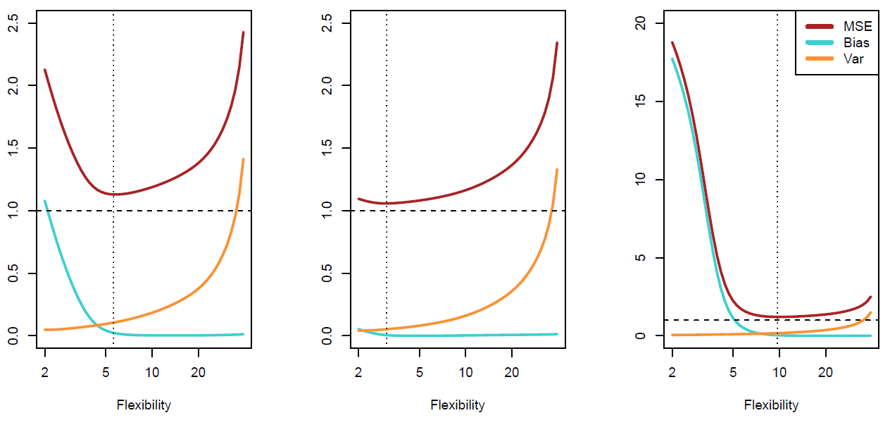
Figure 2.14– Trade-offs between biase and variance. Red is MSE, Blue is Bias, Orange is Variance
Again, in this part the red curve is the mean squared error on the test data. And then below it, we have the two components of that mean squared error, the two important components, which are the bias and the variance. And in the left plot, we’ve got the bias decreasing and then flattening off as we get more flexible, and the variance increasing. And when you add those two components, you get the u-shaped curve. And in the middle and last plots that correspond to the other two examples, the same decomposition is given. And because the nature of their problem changed, the trade-off is changing. OK, so we’ve seen now that choosing the amount of flexibility of a model amounts to a bias-variance trade-off. And depending on the problem, we might want to make the trade-off in a different place. And we can use the validation set or left out data to help us make that choice. But that’s the choice that needs to be made to select the model. Now, we’ve been addressing this in terms of regression problems. In the next segment, we’re going to see how all this works for classification problems.
Classification Problems and K-Nearest Neighbors
Slide 23:
Hastie: OK, up till now, we’ve talked about estimating regression functions for quantitative response. And we’ve seen how to do model selection there. Now we’re going to move to classification problems. And here, we’ve got a different kind of response variable. It’s what we call a qualitative variable. For example, email is one of two classes, spam or ham, ham being the good email. And if we classify in digits, it’s one of 0, 1, up to 9, and so it’s a slightly different problem. Our goals are slightly different as well. Here, our goals are to build a classifier, which we might call \(C(X)\), that assigns a class label from our set \(C\) to a future, unlabeled observation \(X\), where \(X\) is the feature vector. We’d also like to assess the uncertainty in each classification, and we’d also like to understand the roles of the different predictors amongst the \(X\)’s in producing that classify. And so we are going to see how we do that in the next number of slides.
Slide 24:
Hastie: OK. To try and parallel our development for the quantitative response, I’ve made up a little simulation example. And we’ve got one \(x\), one \(Y\). The \(Y\) takes on two values in this example. The values are just coded as 0 and 1. And we’ve got a big sample of these \(Y\)’s from a population.
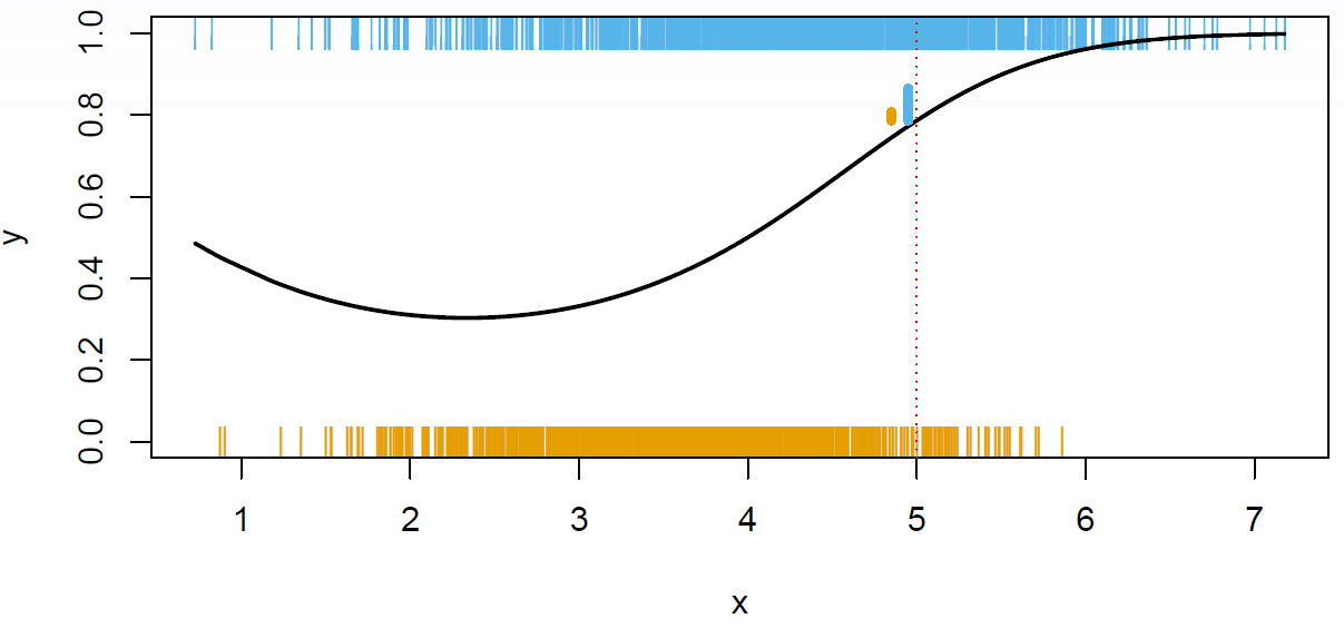
Figure 2.15
So each little vertical bar here indicates an occurrence of a zero, the orange vertical bars, as a function of the \(X\)’s. And at the top, we’ve got where the ones occurred, OK? So this scatter plot’s much harder to read. You can’t really see what’s going on. And there’s a black curve drawn in the figure. And the back curve was what actually generated the data. The black curve is actually showing us the probability of a one in the model that I used to generate the data. And so up in this region over here, the high values of \(X\), there’s a higher probability of a 1, close to 90% of getting a one. And so of course, we see more blue ones there than we see zeroes down there. And even though it’s hard to see, there’s a higher density of zeroes in this region over here, where the probability is 0.4 of being a 1, versus a 0 it’s 0.6. OK, so we want to talk about what is an ideal classifier \(C(X)\). OK, so let’s define these probabilities that I was talking about. And we’ll call \(p_k(x)\), this quantity over here, that’s a conditional probability that \(Y\) is \(k\) given \(X\) is \(x\).
\[p_k(x) = \text{Pr}(Y = k|X = x), k = 1,2,\dotsc,K\]In this case, we’re just looking at probability of 1 in the plot. We’re just showing the probability that \(Y\) is 1 is only two classes. But in general, they’ll be, say, capital \(K\) classes. And they’ll be capital \(K\) of these conditional probabilities. Now in classification problems, those conditional probabilities completely capture the distribution, the conditional distribution, of \(Y\) given \(X\). And it turns out, that those also deliver the ideal classifier. We call the Bayes Optimal Classifier the classifier that classifies to the class for which the conditional probability for that element of the class is largest. It makes sense. You go to any point. So here we’ve gone to point 5 in the \(X\) space. And you look above it, and you see that there’s about 80% probability of a 1, and 20% probability of a 0. And now we’re going to say, well, if you were to classify to one class at that point, which class would you classify to? Well, you’re going to classify to the majority class, OK? And that’s called the Bayes Optimal Classifier.
\[C(x) = j \text{ if } p_j(x) = \text{max}\{p_1(x),p_2(x),\dotsc,p_K(x)\}\]Slide 25:
Hastie: Here’s the same example, except now we’ve only got a handful of points. We’ve got 100 points having one of the two class labels.
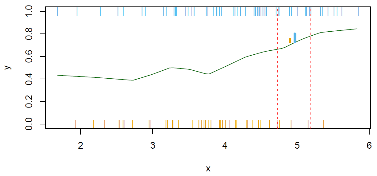
Figure 2.16
The story is the same as before. We can’t compute the conditional probabilities exactly, say, at the point 5. Because in this case, we have got 1 at five and no 0s. So we send out a neighborhood, say, and gather 10% of the data points. And then estimate the conditional probabilities by the proportions, in this case of 1s and 0s in the neighborhood. And those are indicated by these little bars here. These are meant to represent the probabilities or proportions at this point, 5. And again, there’s a higher proportion of 1s here than 0s. I forgot to say that in the previous slide, that’s the same quantity over here that’s indicating the probabilities of the ones and the zeroes. This is the exact in the population. And here it is estimated with the nearest neighbor average. So here we’ve done the nearest neighbor classifying in one dimension. And we can draw a nice picture. But of course, this works in multiple dimensions as well, just like it did for regression. So suppose we, for example, have two \(x\)’s, and they lie on the floor. And we have a target point, say this point over here, and we want to classify a new observation that falls at this point. Well, we can spread out a little, say, circular neighborhood, and gather a bunch of observations who fall in this neighborhood. And we can count how many in class one, how many in class two, and assign to the majority class. And of course, this can be generalized to multiple dimensions. In all the problems we had with nearest neighbors for regression, the curse of dimensionality when the number of dimensions gets large also happens here. In order to gather enough points when the dimensions really high, we have to send out a bigger and bigger sphere to capture the points and things start to break down, because it’s not local anymore.
Slide 26:
Hastie: So, some details. Typically, we’ll measure the performance of the classifier using what we call them misclassification error rate. And here, it’s written on the test data set. The error is just the average number of mistakes we make, OK? So it’s the average number of times that the classification, so \(\hat{C}\) at a point \(x_i\), is not equal to the class label \(y_i\) averaged over a test set.
\[\text{Err}_{\textbf{Te}} = \text{Ave}_{i\in\textbf{Te}}I[y_i \neq \hat{C}(x_i)]\]It’s just the number of mistakes. So that’s when we count a mistake, mistaking a 1 for a 0 and a 0 for a 1 as equal. There are other ways of classifying error, where you can have a cost, which gives higher cost to some mistakes than others. But we won’t go into that here. So that base classifier, the one that used the true probabilities to decide on the classification rule, is the one that makes the least mistakes in the population. And that makes sense if you look at our population example over here. By classifying to one over here, we are going to make mistakes on about 20% of the conditional population at this value of \(x\). But we’ll get it correct 80% of the time. And so that’s why it’s obvious we want to classify to the largest class. We will make the fewest mistakes. Later on in the course, we are going to talk about support vector machines. And they build structured models for the classifier \(C(x)\). And we’ll also build structured models for representing the probabilities themselves. And there, we’ll discuss methods like logistic regression and generalized additive models. The high dimensional problem is worse for modeling the probabilities than it is for actually building the classifier. For the classifier, the classifier just has to be accurate with regard to which of the probabilities is largest. Whereas if we’re really interested in the probabilities themselves, we going to be measuring them on a much finer scale.
Slide 27:
Hastie: OK, we’ll end up with a two dimensional example of nearest neighbors.
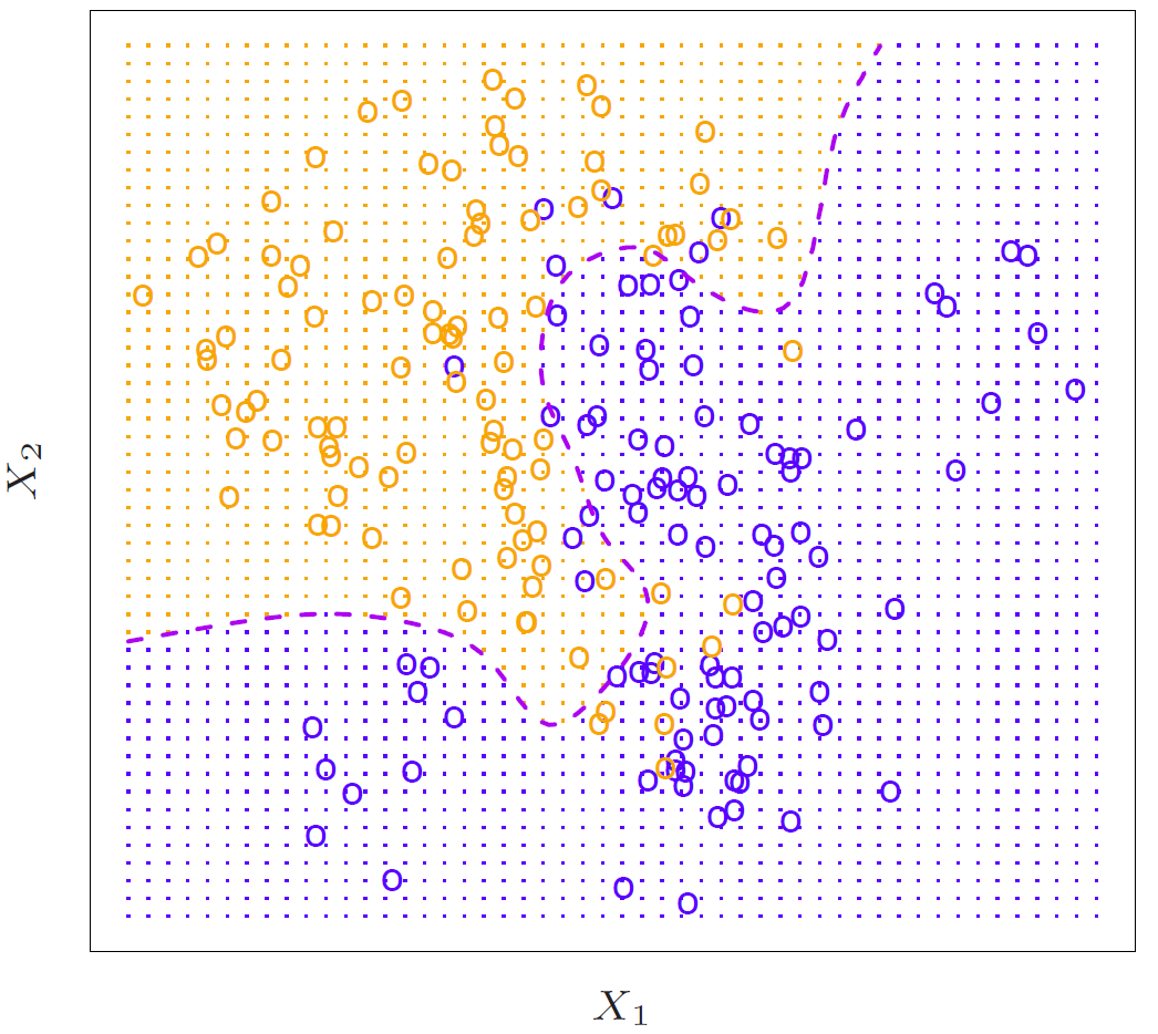
Figure 2.17
So this represents the truth. We got an \(X_1\) and an \(X_2\). And we’ve got points from some population. And the purple dotted line is what’s called the Bayes Decision Boundary. Since we know the truth here, we know what the true probabilities are everywhere in this domain. And I indicated that all the points in the domain by the little dots in the figure. And so if you classify according to the true probabilities, all the points, all the region colored orange would be classified as the 1 class. And all the region colored blue would be classified as the 2 class. And the dotted line is called the decision boundary. And so that’s a contour of the place where, in this case, there are two classes. It’s a contour of where the probabilities are equal for the two classes. So that’s an undecided region. It’s called the decision boundary.
Slide 28:
Hastie: OK, so we can do nearest neighbor, averaging in two dimensions.

Figure 2.18– KNN: K = 10
So of course what we do here is, at any given point when we want to classify– let’s say we pick this point over here– we spread out a little neighborhood, in this case, until we find the 10 closest points to the target point. And we’ll estimate the probability at this center point here by the proportion of blues versus oranges. And you do that at every point. And if you use those as the probabilities, you get this somewhat wiggly black curve as the estimated decision boundary. And you can see it’s actually, apart from the somewhat ugly wiggliness, it gets reasonably close to the true decision boundary, which is, again, the purple dashed line, or curve.
Slide 29:
Hastie: OK, in the last slide, we used \(K = 10\). We can use other values of \(K\). \(K = 1\) is a popular choice.
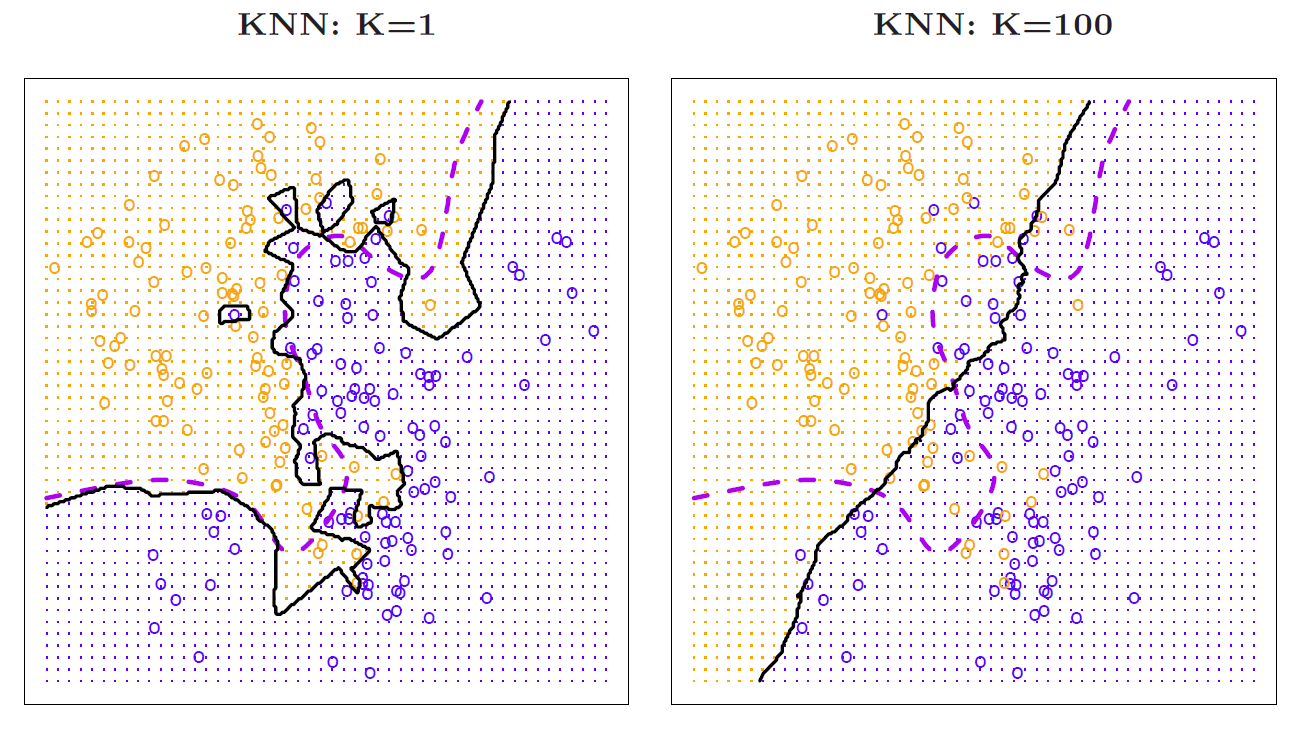
Figure 2.19
This is called the nearest neighbor classifier. And we take literally at each target point, we find the closest point amongst the training data and classify to its class. So for example, if we took a point over here, which is the closest training point? Well, this is it over here. It’s a blue. So we’d classify this as blue. Right, when you’re in a sea of blues, of course the nearest point is always another blue. And so you’d always classified as blue. What’s interesting is as you get close to some of the orange points. And what this gives you– you can see the boundary here is a piecewise linear boundary. Of course, the probabilities that we estimate is just one and zero, because there’s only one point to average. So there’s no real probabilities. But if you think about the decision boundary, it’s a piecewise linear decision boundary. And it’s gotten by looking at the bisector of the line separating each pair of points when they’re of different colors. So you get this very ragged decision boundary. You also get little islands. So for example, there’s a blue point and a sea of oranges here. So there’s a little piecewise linear boundary around that blue point. Those are the points that are closest to that blue point, closer to the blue point than the oranges. Again, we see the true boundary here, or the best base decision boundary is purple. This nearest neighbor average approximates it in a noisy way. Now then, you can make k really large. Here, we’ve made \(K\) 100. And the neighborhood’s really large. There’s 200 points here. So it’s taken half the points to be in any given neighborhood. So let’s suppose our test point was over here. We’d be sending out quite a big circle, gathering 100 points, getting the proportional of blues, the proportion of oranges, and then making the boundary. So as k gets bigger, this boundary starts smoothing out and getting less interesting in this case. It’s almost like a linear boundary over here, and doesn’t pick up the nuances of the decision boundary. Whereas with \(K = 10\), it seemed like a pretty good choice, and of approximates that this is the decision boundary pretty well. OK, so the choice of \(K\) is a tuning parameter.
Slide 30:
Hastie: And that needs to be selected. And here we showed what happens as you vary \(K\), first on the training data and then on the test data.

Figure 2.20
So on the training data; \(K\) tends to just keep on decreasing. It’s not actually monotone. Because we’ve actually indexed this as 1/\(K\), because as 1/\(K\) gets big, let’s see. \(K\) large means we get a higher bias, so 1/\(K\) small. So this is the low complexity region. This is the high complexity region. Now you notice that the training error for one nearest neighbors, which is right down at the end here, 1/\(K = 1\) is zero. Well, if you think about it, that’s what it’s got to be, if you think about what training error is. For the test error, it’s actually started increasing again. This horizontal dotted line is the Bayes error, which you can’t do better than the Bayes error in theory. Of course, this is a finite test data set. But it actually just touches on the Bayes error. It starts decreasing, and then at some point, it levels off and then starts increasing again. So if we had a validation set available, that’s what we use to determine \(K\). So that’s nearest neighbor classification. Very powerful tool. It’s said that about one third of classification problems, the best tool will be nearest neighbor classification. On the handwritten zip code problem, the classifying handwritten digits, nearest neighbor classifiers do about as well as in any other method tried. So it’s a powerful technique to have in the tool bag, and it’s one of the techniques that we’ll use for classification. But in the rest of the course, we’ll cover other techniques as well, in particular, with the support vector machines, various forms of logistic regression and linear discriminant analysis.