Are the 'Circumstances' Really Against the Blue Jays in the Postseason?
October 17, 2016By Timothy Art, Jonathon Barbaro, Rafael Nicolas Fermin Cota, and Abhinav Jindal
After beating the Texas Rangers in a 3-0 series sweep during the ALDS, the Toronto Blue Jays now find themselves in an uncomfortable position down 0-2 against the Cleveland Indians. Despite great starts from Marco Estrada and J.A. Happ, it looks as though the Jays’ bats have gone cold once again. Cleveland’s starters and the bullpen have been exceptional, shutting down the Jays’ offence to 1 run in 2 games. However, the Jays’ hitters have had their opportunities–with multiple runners in scoring position–but have mostly come up short with the exception of the Donaldson double in Game 2.
In the interest of finding the reason behind the Jays’ lack of hitting, let’s take a closer look at the matchups so far and the ones to come. To perform this analysis, we’ll create heatmaps to find some key statistics on batters, pitchers, and umpires. We developed a simple app that allows you to perform the analysis discussed in this post for any players and/or umpires in the big leagues. You can find the app here. We encourage you to play around with matchups for the National League Championship Series as well. We’ll see you in the World Series, Cubs!
Data
All data comes from the PITCHf/x database. We are using the data recorded for every game played in the 2016 season so far, which totals to about 2430 regular season games and the first round and a half of the playoffs.
Batter-Pitcher Heatmaps
The first thing we’ll look at is how an individual hitter is expected to perform against a given pitcher.
Batter
Inspired by the analyses and visualizations in the book, The Science of Hitting by Ted Williams and John Underwood, we display hitters’ batting averages across different regions of the strike zone. Since we already have the data for every pitch faced by the hitters over the season, we can easily map the true location of every hit and out for every batter. We’re only interested in hit/out probability and only need the last pitch of the at-bats. After this, we filter out any walks, sacrifice flies or sacrifice bunts so we’re left with only the batter’s true attempts. Since the last pitch for official at-bats over one season is not a very large number and we want to get an idea of the probability of a hit depending on location, we run the data through a generalized additive model. This gives us the probabilities of a hit for every point in our grid. Now we lump these into buckets of probabilities for visualization, and we end up with some nice-looking heatmaps like the following for Jose Bautista (because whether he stays or goes next year, he will always be regarded among the greatest baseball players to have played for this city):
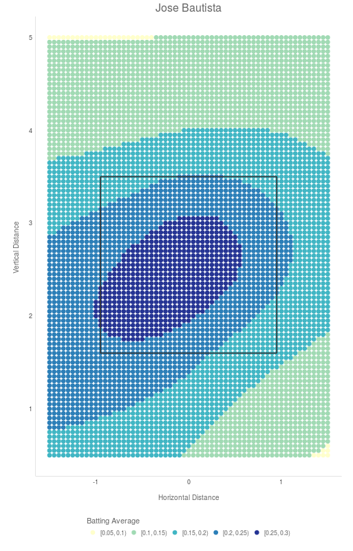
This graph shows the strike zone from the perspective of the catcher. The darker colours represent a higher probability of the batter hitting the ball. We see from this chart that Jose has a pretty sizeable sweet spot in middle-to-left region of the strike zone (dark blue). This verifies what we already know about Jose– that he is stronger inside the strike zone. Keep in mind that as we move away from the strike zone, the probabilities become less meaningful since there are fewer pitches in thrown in those regions and the likelihood of a swing decreases.
You can also see that, in 2016, Jose did not hit over .300 in any region of the plate. Compare that with his heatmap for the 2015 season and you’ll see a drastic difference.
This puts in perspective the kind of year he’s had– thanks to two of the most bizarre injuries a baseball player can face. There is a whole breadth of analysis we can perform to realize that the 2016 season was only a blip in Jose’s career and not a downward trend, but that is a discussion for another day.
Pitcher
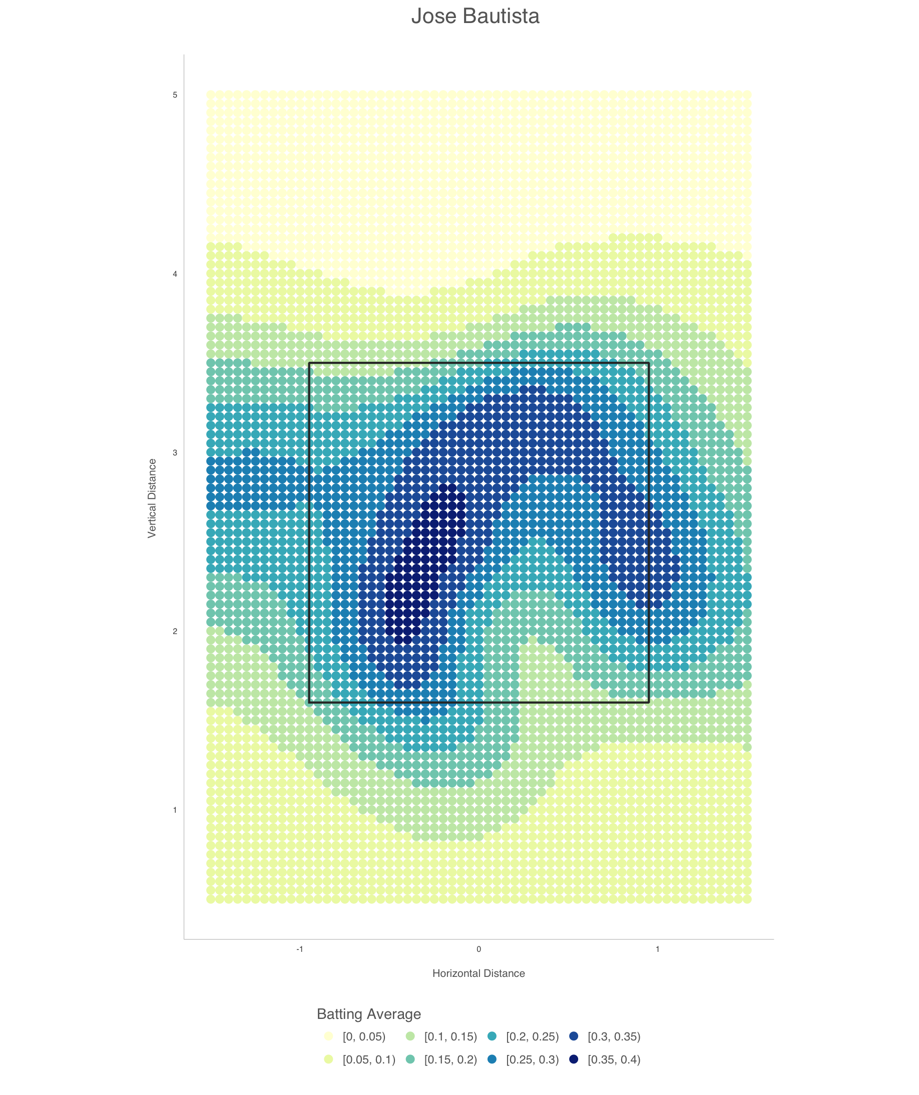
We can perform a similar analysis for pitchers as well by plotting out the regions in the strike zone where they allow a high percentage of hits. It’s the same concept as before, where we divide the strike zone into coordinates and plot the probabilities of hits at each point. The only difference is that this time, we map all pitches thrown by a pitcher as opposed to the hitters where we only took when an official out or a hit was recorded. Again, we eliminate sac flies, sac bunts and walks. Let’s take a look at the map for Aaron Sanchez who is having a break-out year despite all the controversy around his pitch limit:
Here, you can see that its lights out over a majority of the zone with small spots of high hit probabilities perfectly in the middle and on the right side of the zone (which is very interesting to see). Again, keep in mind that the large dark area on the right beyond the strike zone is largely meaningless since there is minimal data for this region and hitters are not swinging at pitches that far away from the zone. We are very confident that Aaron is going to repeat his success again in Game 4 of the ALCS.
Matchup
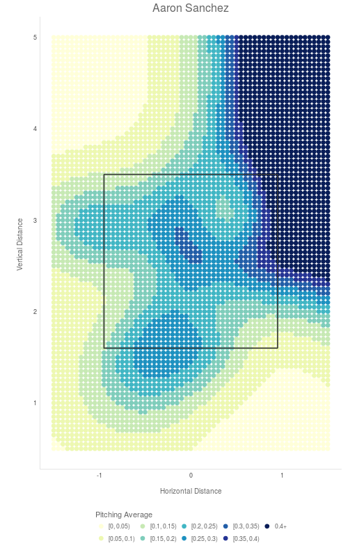
Now, we can combine the two maps for a batter and a pitcher to get an understanding of the areas of the strike zone that are favourable for either. We look at the parts of the zone where the probability of a hit improves for the batter when facing the respective pitcher. If a batter is stronger in a particular spot than the pitcher, he has a clear advantage. We plot the batter’s advantage over the pitcher on a scale of -4 to 4 where a positive value means the hitter holds the advantage in that region and negative means the pitcher holds an advantage. This knowledge can help the players during at-bats. Hitters can sit on pitches in advantageous regions on the strike zone and pitchers can try throw in regions where they are stronger.
We have seen this play out in the first two games already. Let’s set the stage for a key matchup in Monday night’s game: Josh Donaldson vs. Trevor Bauer. Let’s look at how the matchup between those two will look like based on their hit/hits allowed probabilities over the season.
On this graph, the red region represents the area that is favourable for Bauer and the blue shows regions favourable to Donaldson. The lighter regions are neutral. From this map, we can see that Donaldson has a significant advantage on the inside part of the plate towards the middle of the strike zone, while Bauer is stronger on the inside corners. This will make for a very exciting matchup as Donaldson will be looking to jump on any mistakes by Bauer on the inside part of the plate. Maybe Bauer’s drone-injured pinky plays a role in this game?
Umpire-Pitcher Heatmaps
If you’ve been following the series at all then you know about the questionable calls from umpire Laz Diaz in the first game. With this in mind let’s try to take the matchups one step further by comparing the umpire’s strike calls with a pitcher’s thrown strikes over the season. We create a heatmap showing where an umpire is most likely to call a strike and compare that with a probability heatmap of the pitchers strikes and balls. For these graphs, we take every pitch thrown by a pitcher or seen by an umpire where the call was either a Ball or a Called Strike.
Umpire
We use a similar strategy as the batter-pitcher matchup discussed above to discover regions on the strike zone where an umpire usually calls a strike and see if these regions creep into the objective strike zone. This gives a clear picture of the umpire’s true strike zone over the season. Let’s take a look at Laz Diaz’s heatmap to find out where he’s likely to call a strike:
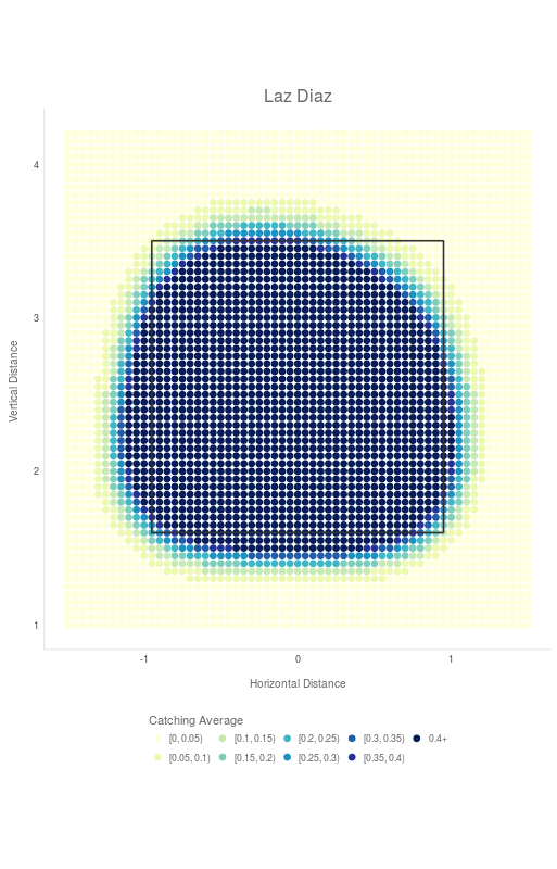
The dark blue represents locations where the umpire is most likely to call a strike. From the heatmap, Diaz’s strike zone seems to be shifted towards the left and down. Diaz has a tendency to call strikes even when they are outside the strike zone to the left and underneath. This makes it tougher for hitters who might rightfully pass on a pitch that’s low or outside and still get called out. On the other hand, the top right corner is more likely to be a ball, making it harder for high fastball pitchers to get swings and misses if the umpire is less likely to call a strike even when it is hittable. We understand that usually it is not the location of the zone, but the consistency of calls that frustrates the players. At least this graph gives them an idea of what to expect before going into a game.
 Melvin Upton gets called out by Laz Diaz on a questionable pitch called strike in game one of the ALCS
Pitcher
Performing the identical calculations on all pitches thrown by a pitcher over the season, we can get the true strike zone for that pitcher. This strike zone would be based on all pitches called balls or strikes. For example, let’s see Andrew Miller’s strike zone, who has been extremely hard to figure out for the Blue Jays bats:
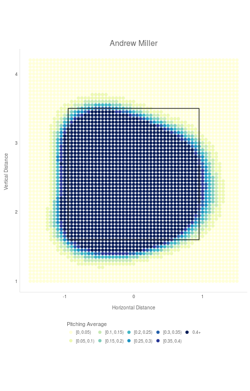
He usually gets strike calls outside the objective strike zone to the bottom left of the strike zone. We have seen many of his insane sliders in the series to know how hard it can be for umpires to see those all the way through the zone. It’s probably much better for a pitcher like Miller when he is matched up with an umpire like Laz Diaz because he has a higher tendency to call those strikes. We clearly saw this pan out in Game 1 with the calls against Melvin Upton, Jr. and Edwin Encarnacion.
Matchup
So, why not combine the two graphs and visualize the favourable zones for a pitcher with a given umpire behind the plate? Monday night’s matchup has Marcus Stroman up against Trevor Bauer with Umpire Brian Gorman calling strikes and balls.
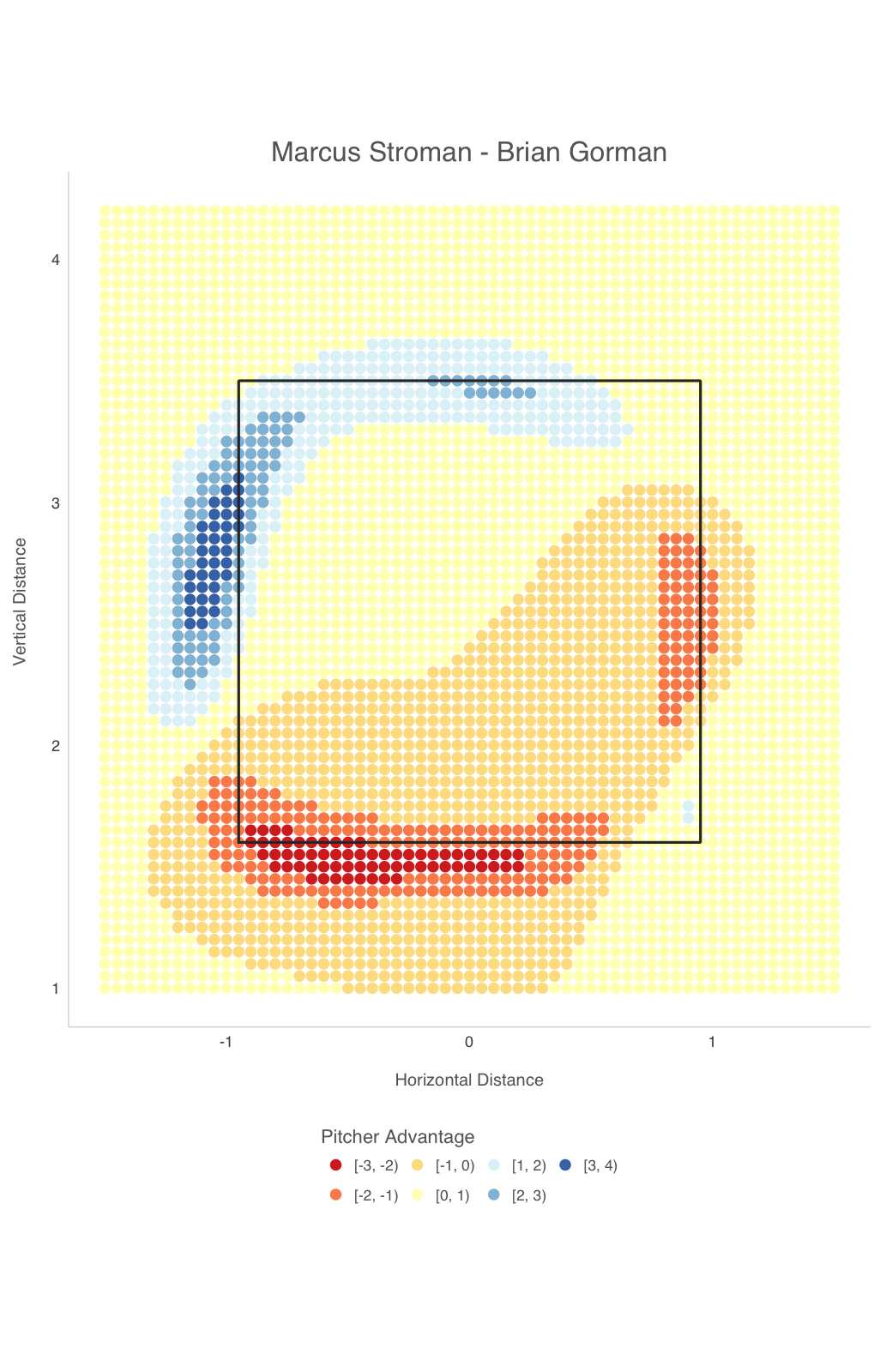
The blue area here represents where the pitcher has a better shot of getting called strikes, the red is the areas the pitcher may want to avoid. Sure enough, Stroman is stronger at the bottom part of the strike zone. However, it might be worthwhile to consider throwing in the top left corner as Umpire Brian Gorman is more likely to call those strikes than pitches across the bottom edge.
ALCS Game Three
As the series heads back to Toronto for game three on Monday night, we thought it would be interesting to see what the next match-up might have in store.
Let’s take a look at the two starting pitchers for game three, Stroman and Bauer, and do a quick comparison with sluggers from both teams.
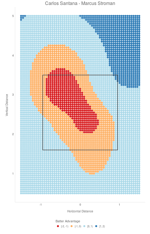
We will start with Stroman and Santana:
Next Bauer and Encarnacion:
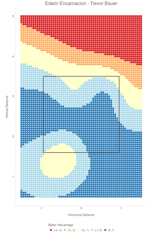
Stroman seems to own the strike zone against Santana; however, Santana has a lot of favourable areas in the top right region above the strike zone. In contrast, Edwin has a much better chance of making contact with balls in the strike zone and balls thrown down and away. In general, however, Santana has a higher probability of making contact against Stroman than Eddie does against Bauer.
It will be interesting to see how things play out Monday night, and whether or not the Jays will get the bats going once more. Go Jays Go!!
Our current research in Sports Analytics is sponsored by Intellitix